Prompt to Search--
AI Tool Finding
Web App
01 / Project Overview
Nexa is an AI-powered tool discovery platform designed to help users find the right AI solutions based on intent rather than exact keywords.
Instead of relying on traditional search inputs, Nexa leverages AI-assisted guidance to translate vague or unstructured needs into relevant, decision-ready results.
02 / Project Challenges
Despite the growing number of AI tools, discovering the right one remains cognitively demanding. Users often struggle to:
Articulate clear or effective search queries
Compare a large volume of similar tools with confidence
Refine their search intent as they learn more during exploration
Navigate discovery without falling into repetitive trial-and-error loops
These challenges highlight the gap between how users think about their needs and how traditional search systems expect queries to be formed.
03 / Problem Statement
How might we design a search experience that helps users clarify intent, reduce cognitive load, and confidently navigate AI tool discovery?
Information
User Surveys | Personas | Competitive Analysis | Journey Maps | Content Strategy Map
Core interaction flows | Prioritized feature set | High-fidelity prototypes | Design System
Visit NEXA.AI
When I entered the team, the product had just released its first MVP. My role began with understanding its real-world performance including reviewing analytic data, observing user behaviors, and interviewing early adopters.
I. Research Process
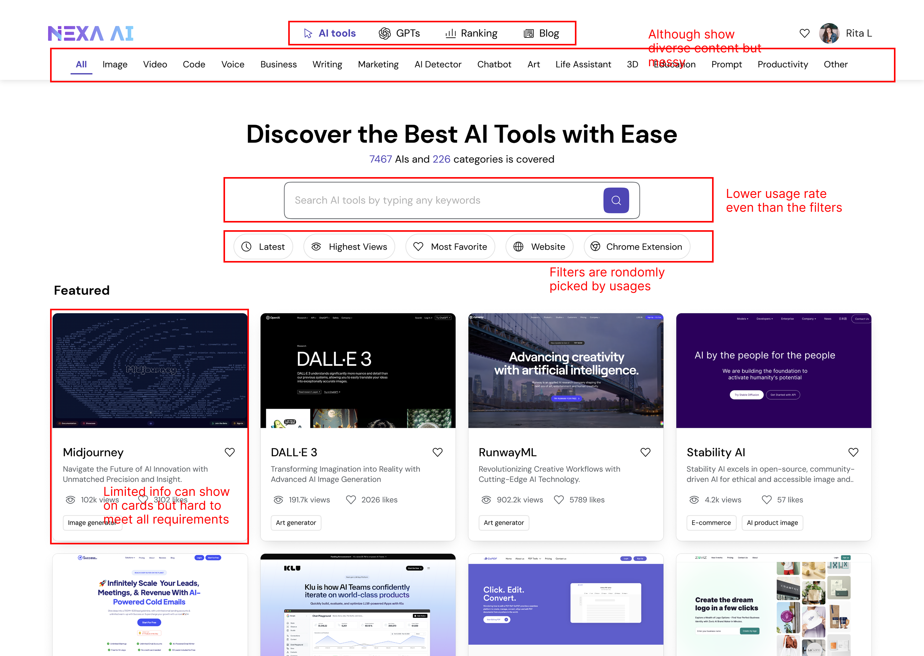
1.1 — MVP Critique
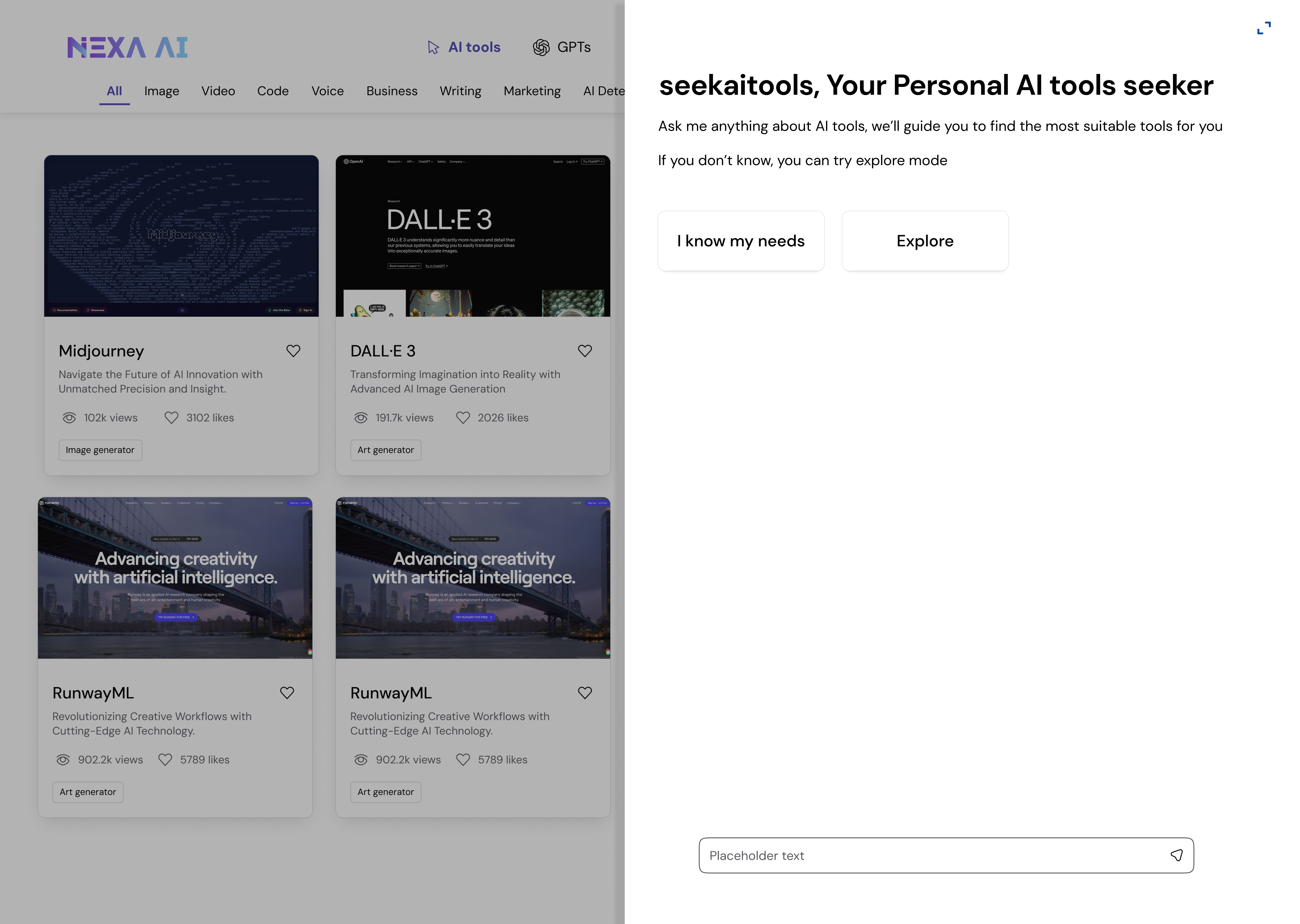
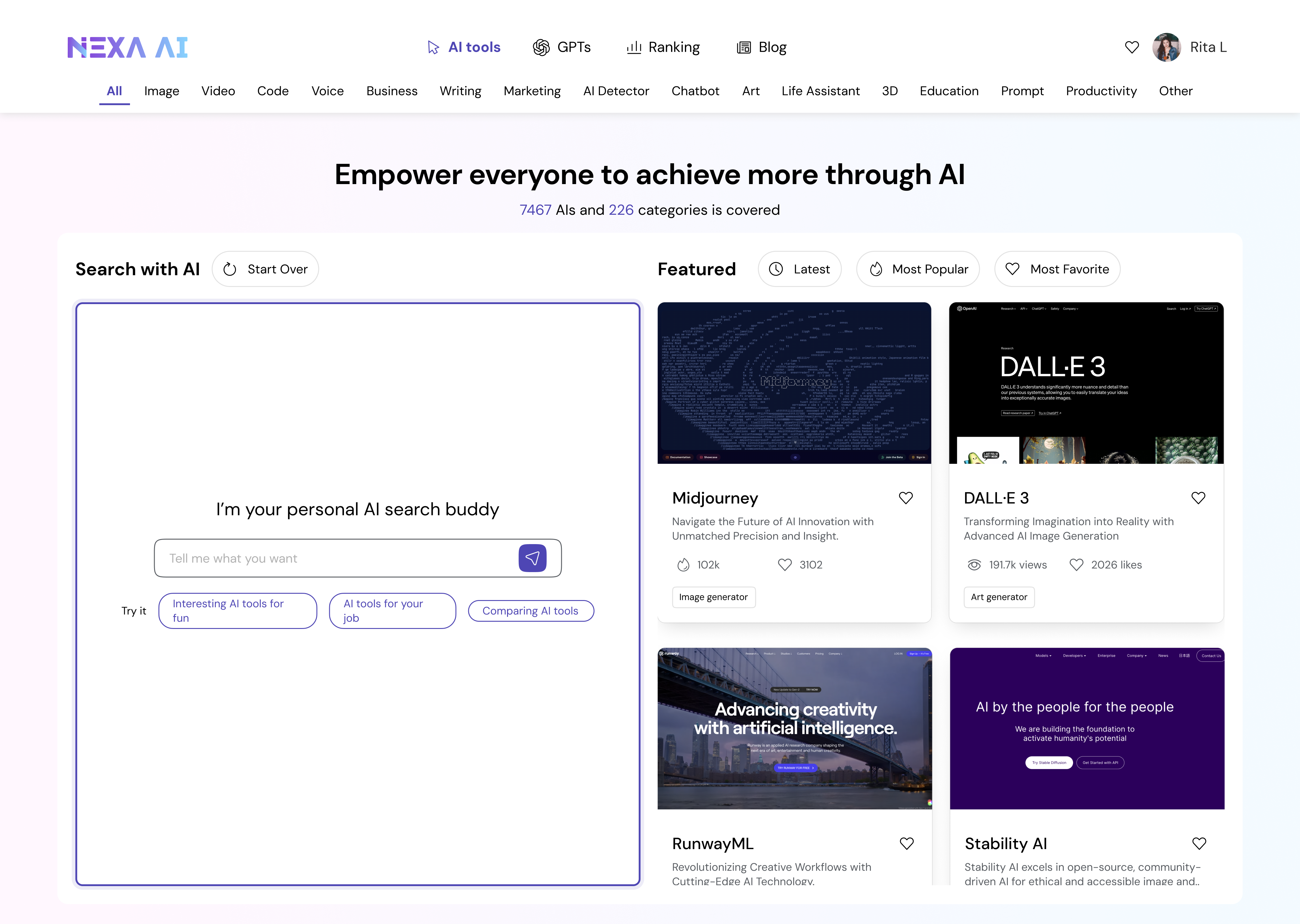
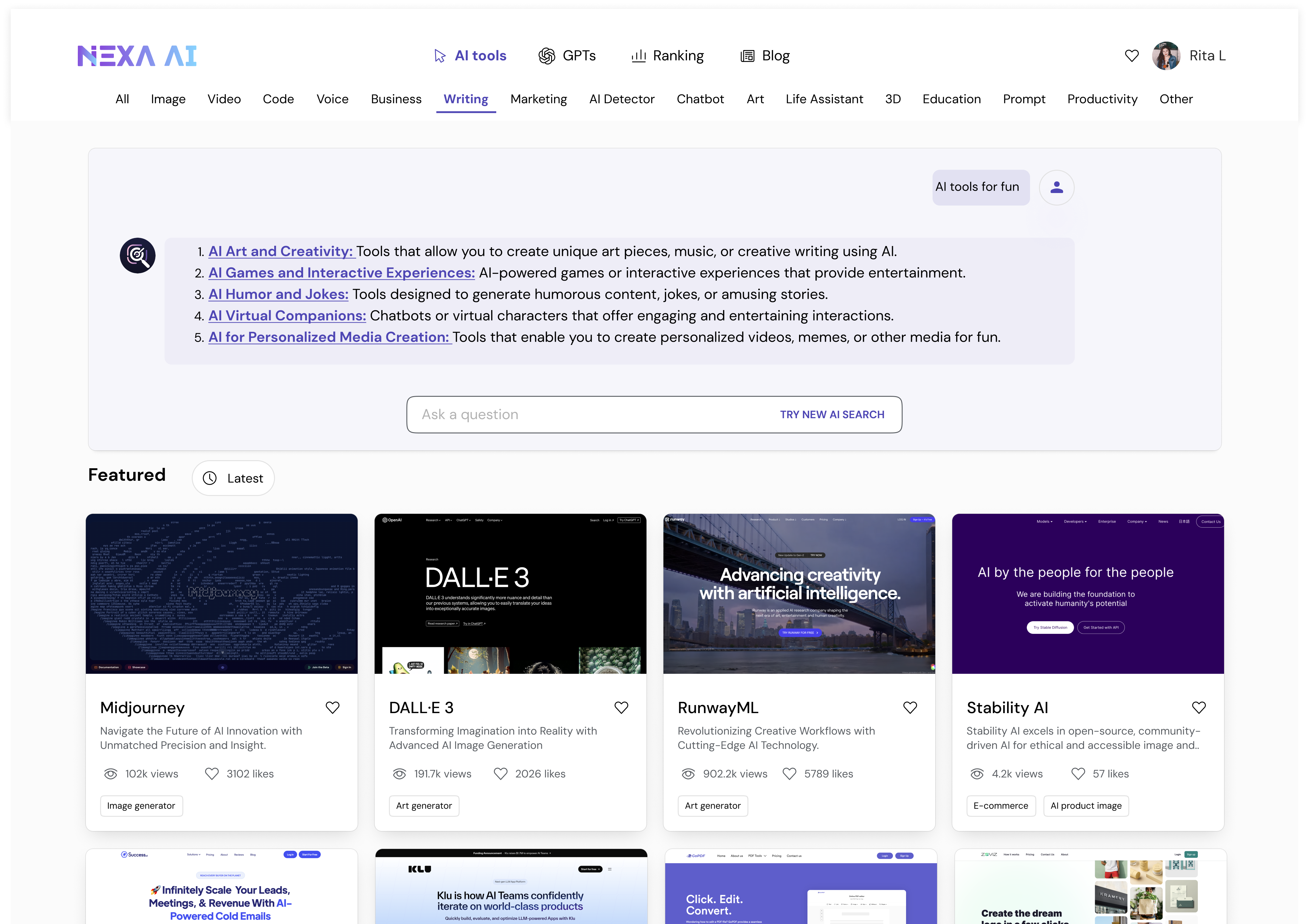
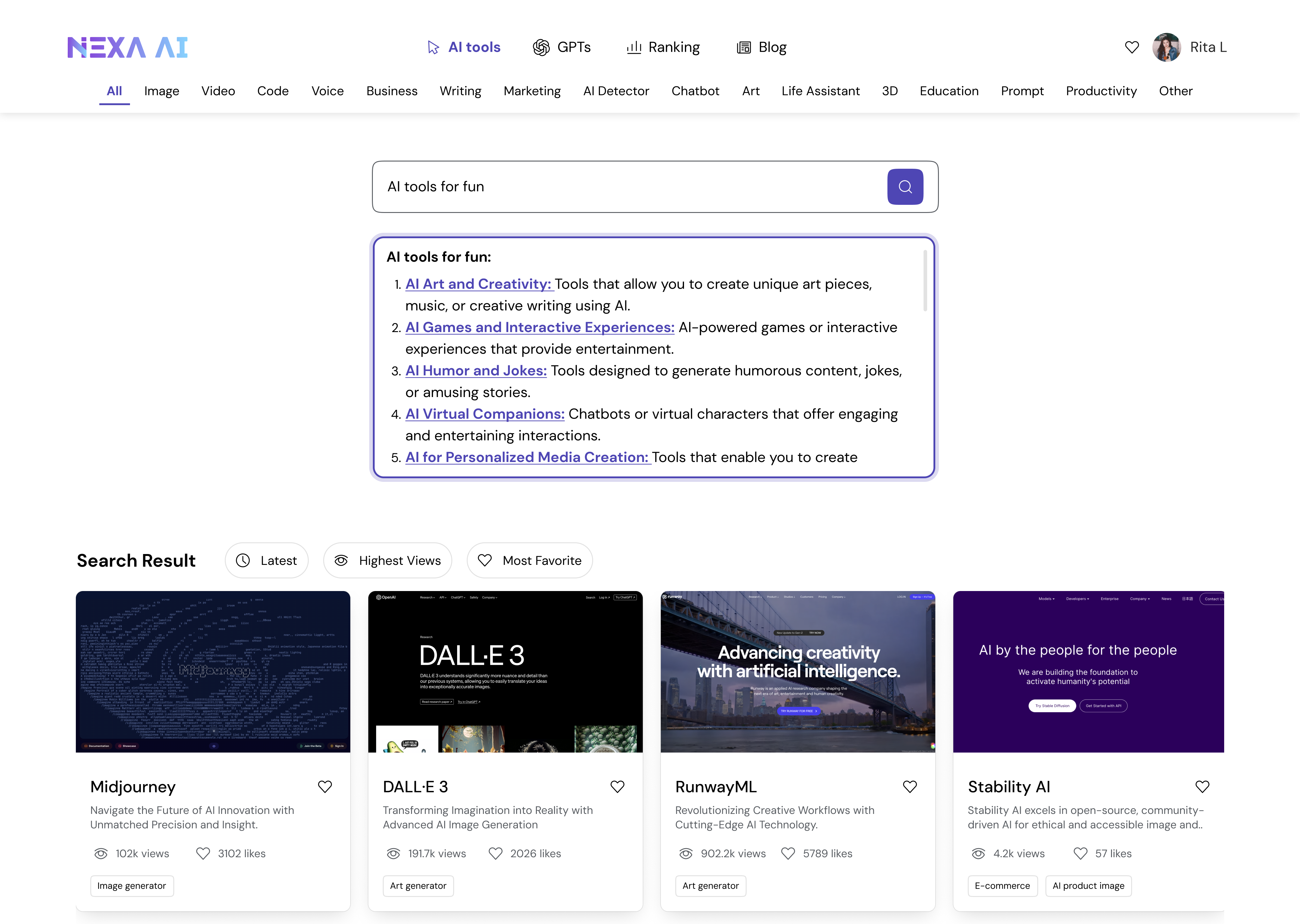
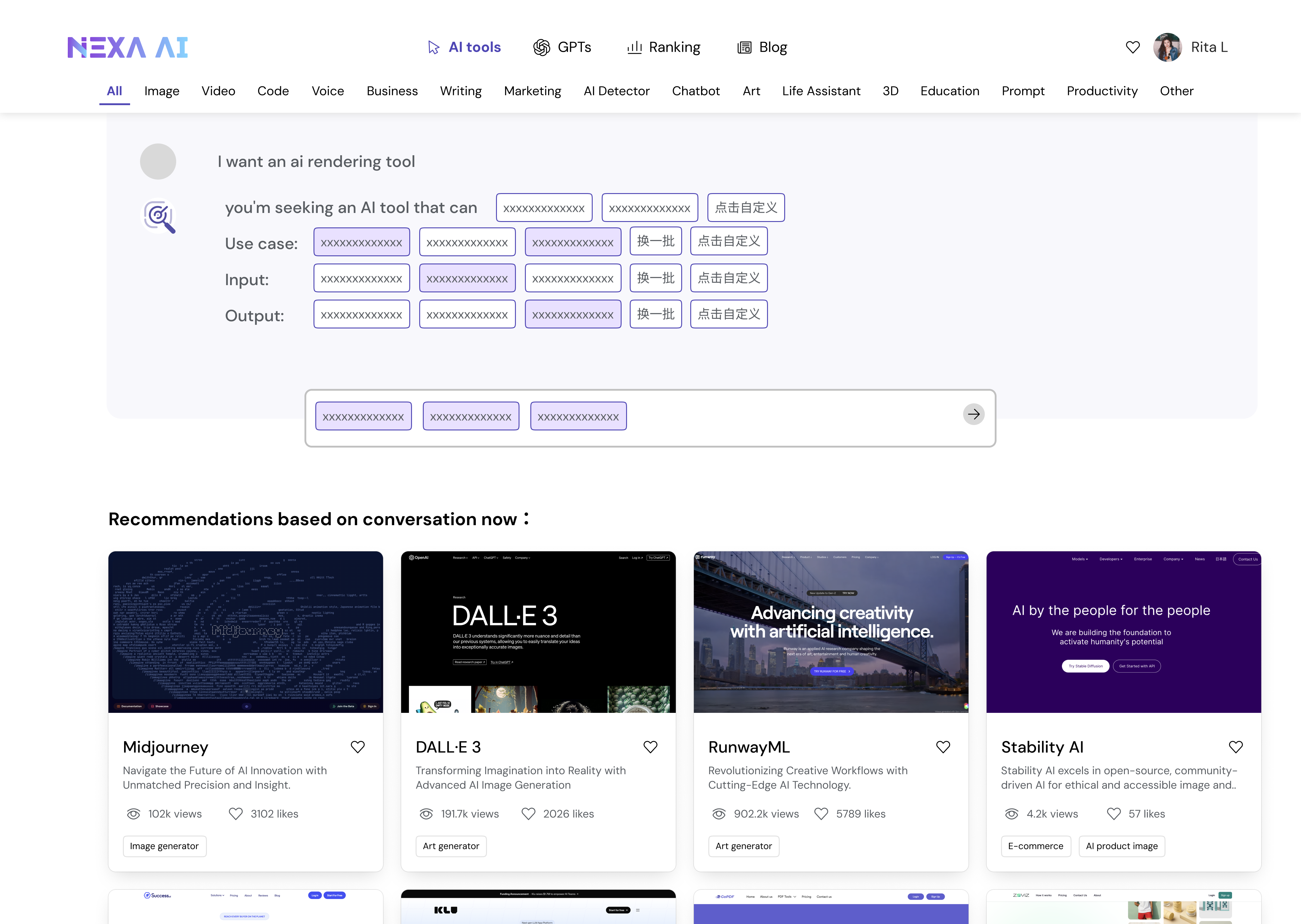
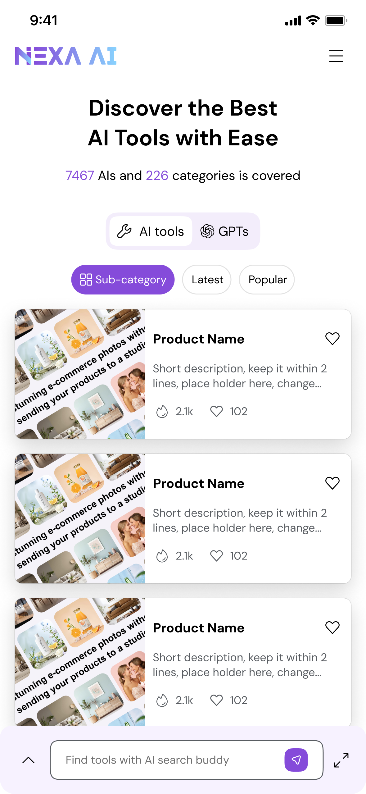
When I joined, one of my first tasks was to examine how users were interacting with the MVP. Although the product successfully aggregated thousands of AI tools, the experience revealed a deeper issue: users didn’t know how to navigate or express what they needed.
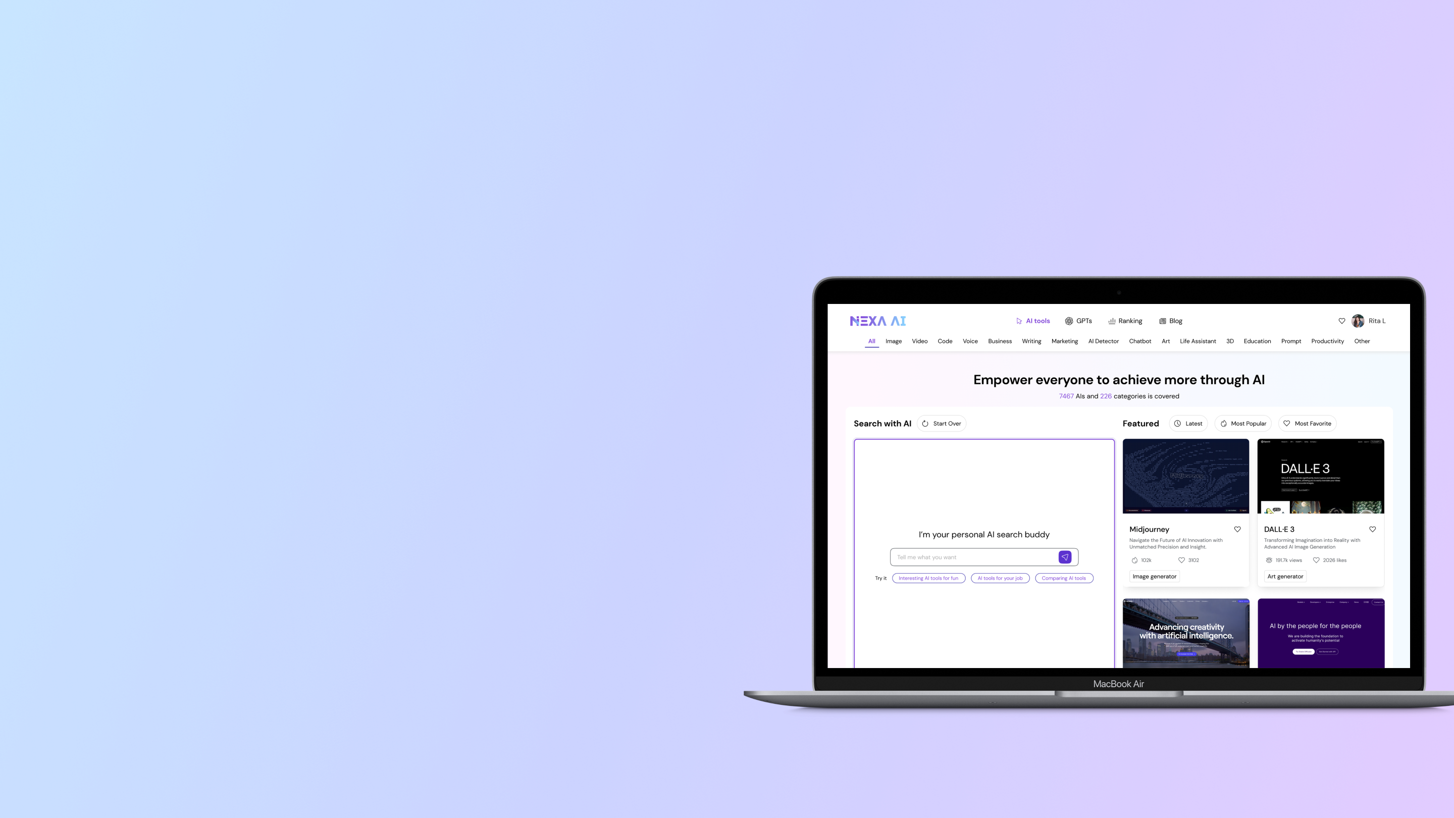
Web MVP
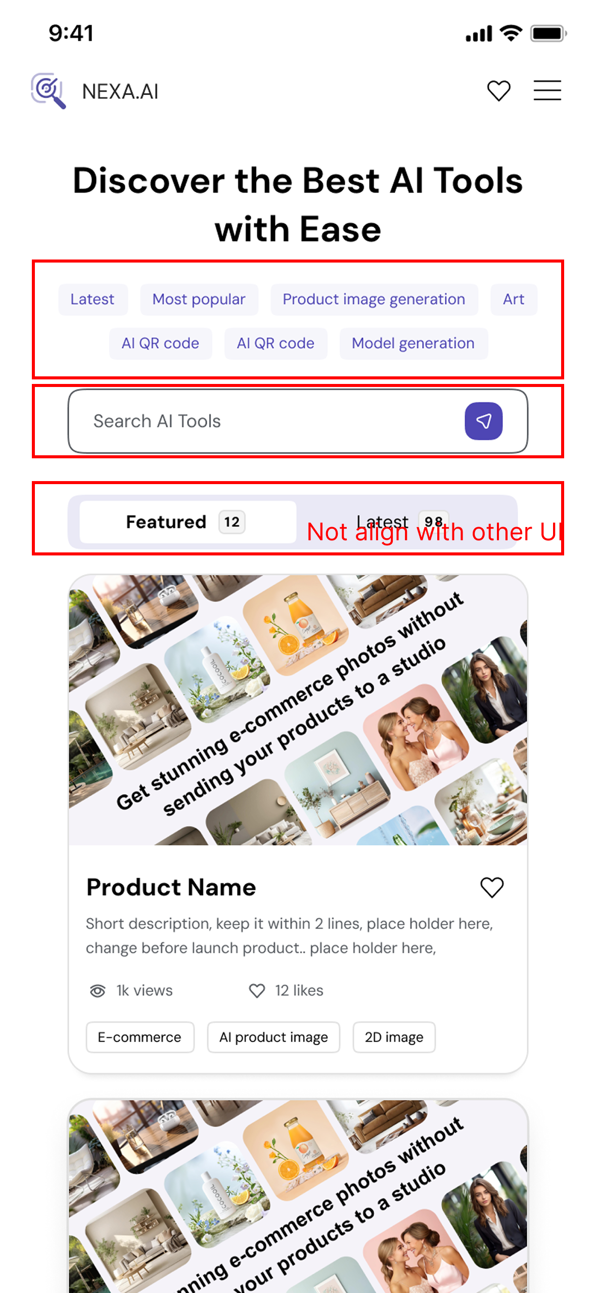
Mobile MVP
01 / Navigation Overload
The top navigation exposed too many content, creating noise and making it unclear where users should begin.
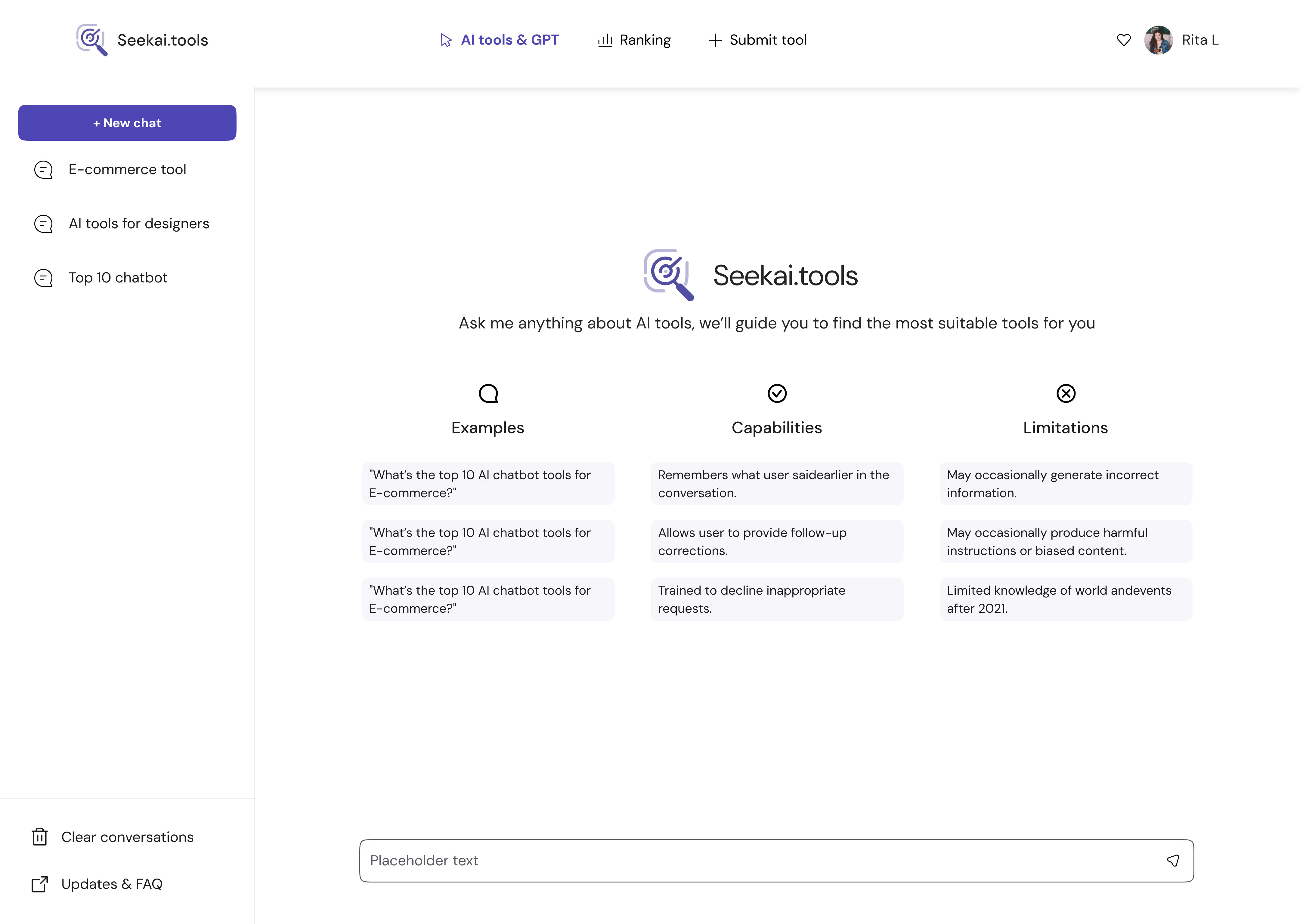
02 / Ineffective Search
The search bar had low usage because users didn’t know what to type and the system didn’t support vague queries.
03 / Data first, Not User
Filters were generated by popularity, resulting in random, unhelpful options.
04 / Space Constraints
Limited space for showing info, but hard to balance different user needs. Users had to click into tools.
05 / Inconsistent Mobile
On mobile, filters and UI patterns are misaligned with the rest of the system, further hurting clarity and usability.
HMW create an intuitive, intent-aware discovery experience that helps users start easily, refine confidently, and evaluate tools with minimal effort?
1.2 — Understand the Industry
2024 marked a turning point in how people interacted with AI. As large language models(LLMs) became mainstream, users grew more comfortable expressing needs in natural language—but far less comfortable navigating categories, keywords, or technical terminology.
Most users knew what they wanted to achieve, but not what kind of AI tool, GPT, or API could help them do it. Meanwhile, the ecosystem expanded faster than user literacy: thousands of tools, overlapping features, inconsistent naming, and unclear differentiation.
1.3 — AI Product Design Principles
By aligning model strengths with market needs, I shaped the value proposition that became the north star of every design decision:

01 — Align With User Nature, Not How Tools Are Categorized
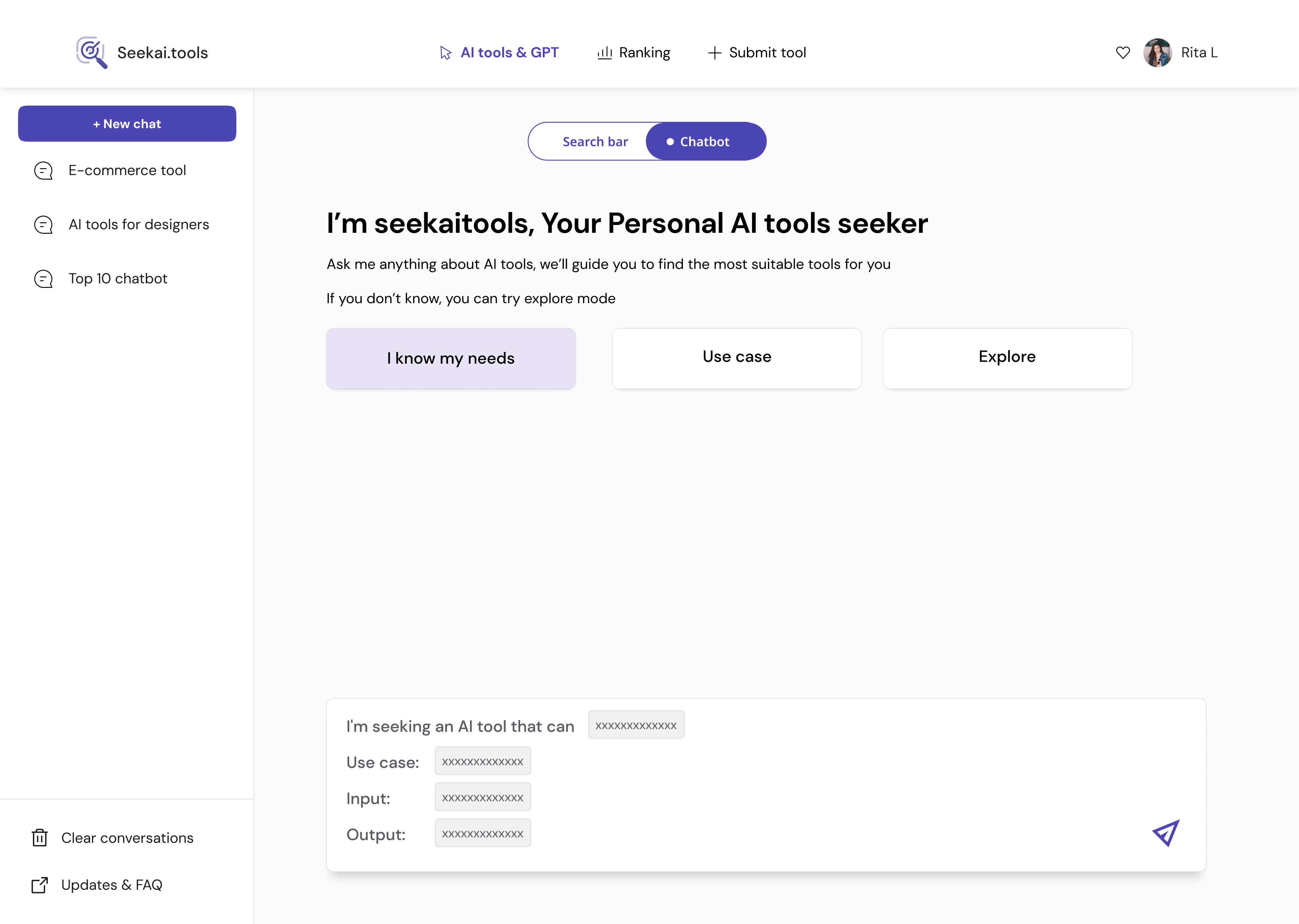
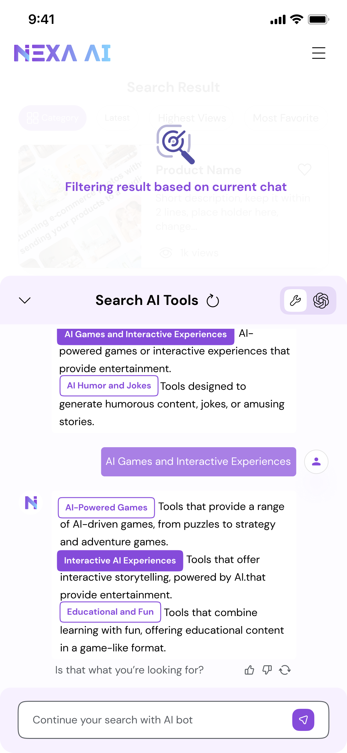
Users don’t think in keywords or categories—they think in goals, tasks, and situations.Our interface starts with natural language input and structures it into meaningful intent dimensions (task, goal, constraints, context).

02 — Make the System’s Understanding Visible
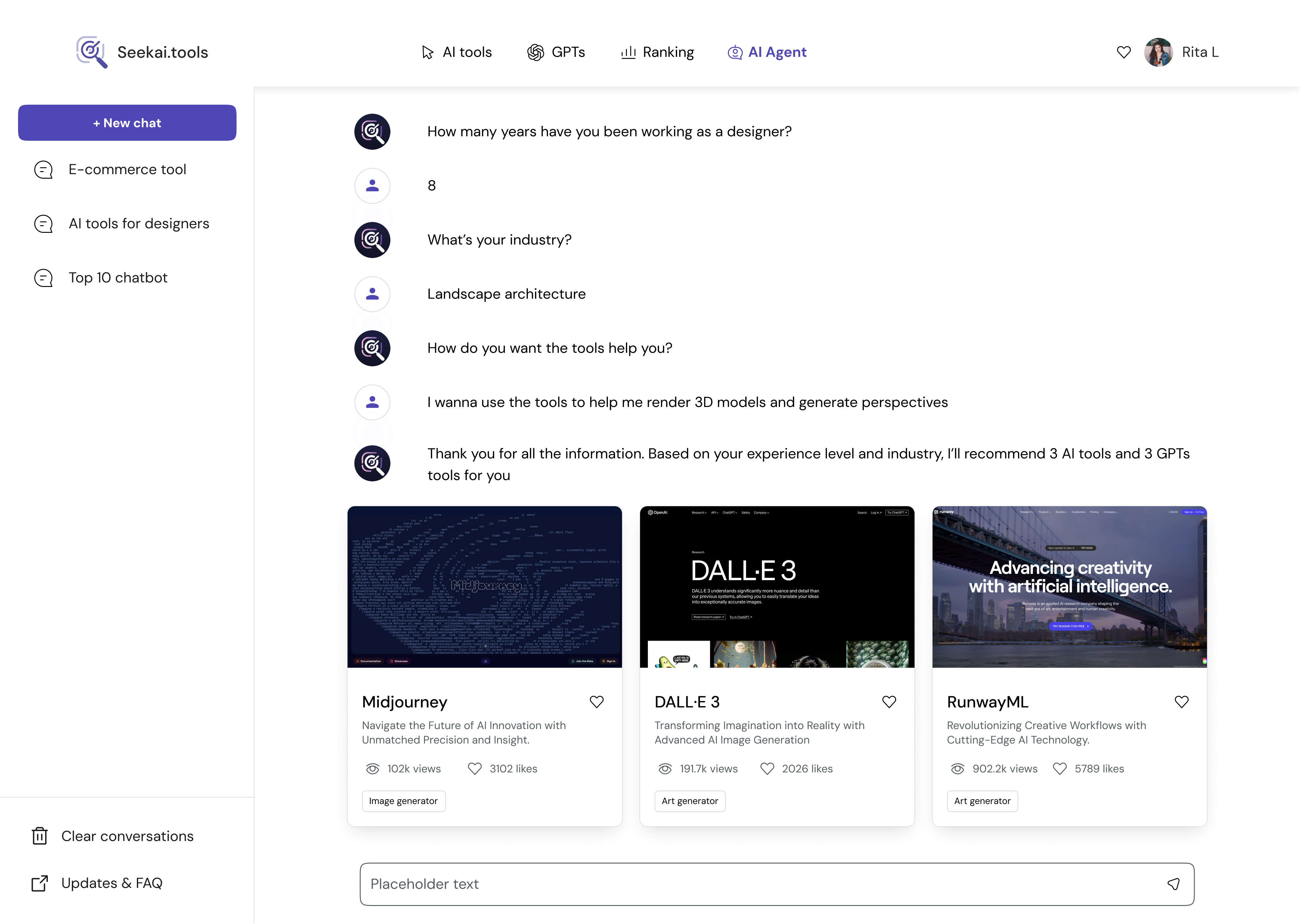
Every step of the process—intent extraction, categorization, reasoning—should be legible to the user.We expose the system’s interpretation of their text so users can validate and correct it.

03 — Reduce Cognitive Load by Guiding Momentum
Instead of confronting users with dozens of filters or choices, the system guides users forward with light-touch refinement steps, recommended categories, and curated results.
04 — Design for Ambiguity, Not Perfection
User inputs are often vague, incomplete, or incorrect.The system must handle ambiguity gracefully—asking clarifying questions, inferring context, and offering suggestions.

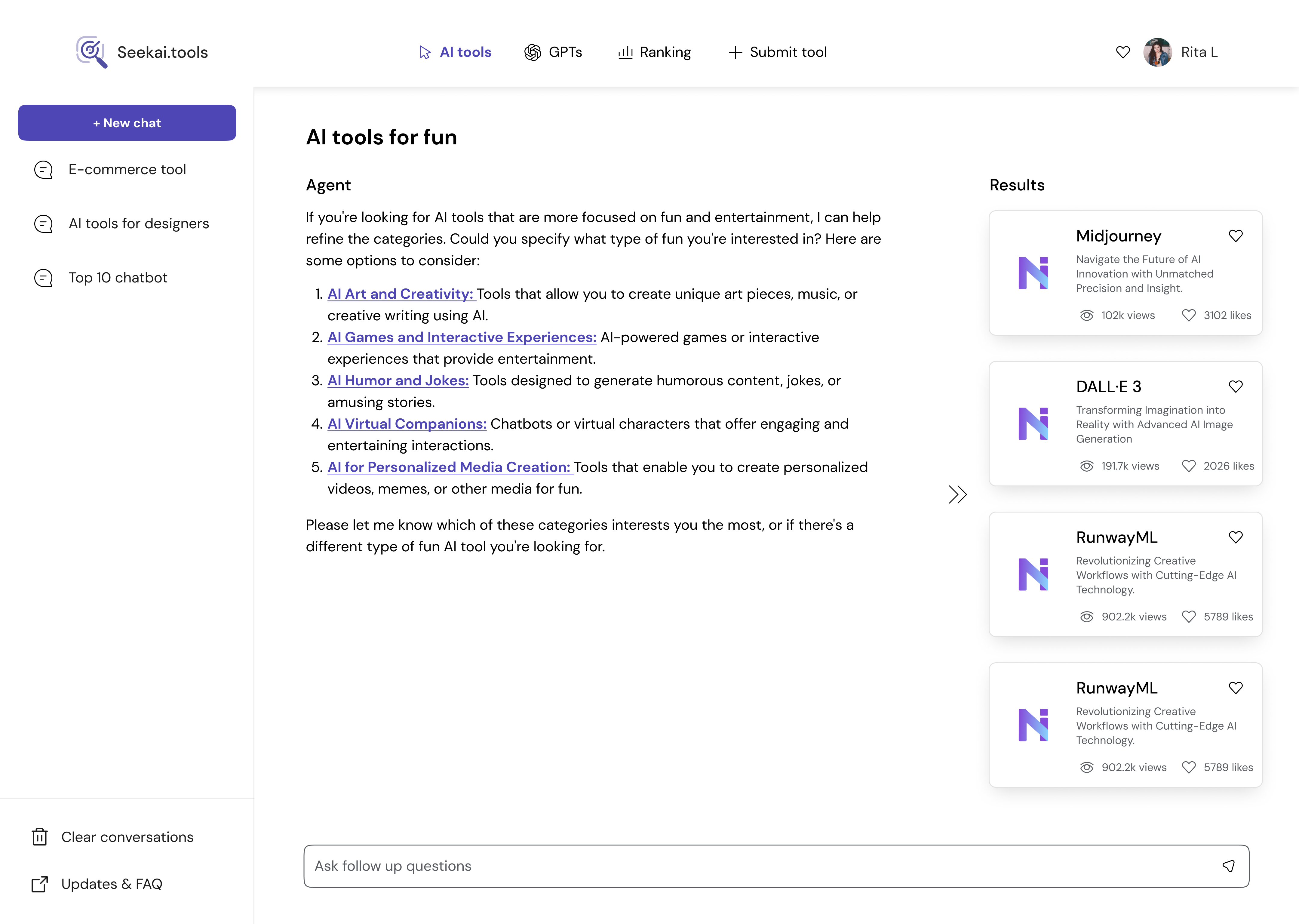
05 — Curate Results With Contextual Meaning
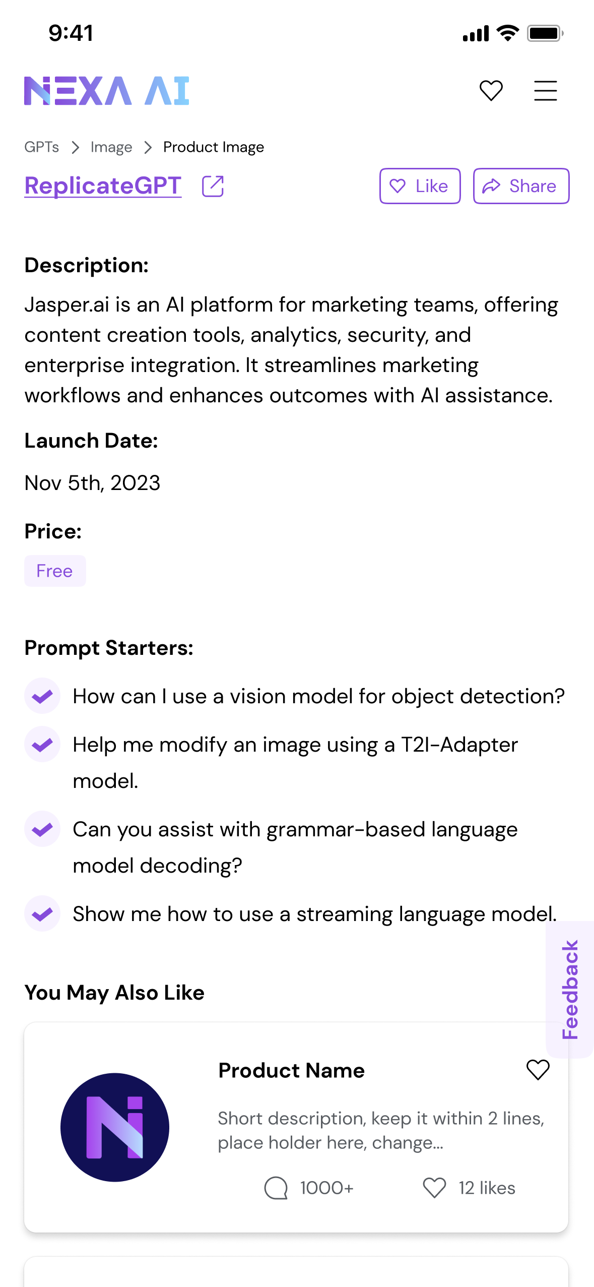
Results (AI tools, GPTs, APIs) should not be displayed as a flat list. They should be framed by:why they match the user’s intentwhat makes them differenthow they solve the user’s goal

06 — Maintain Structural Integrity Across Platforms
Discovery should feel consistent whether users are on desktop or mobile.Layouts, refinement steps, and intent breakdowns follow a shared logic—even as their presentation adapts.
1.4 — User Scenario Analysis
While defining the value story, I also Interviewed a few potential users recruited from huggingface and LinkedIn—mainly engineers familiar with evaluating new models.
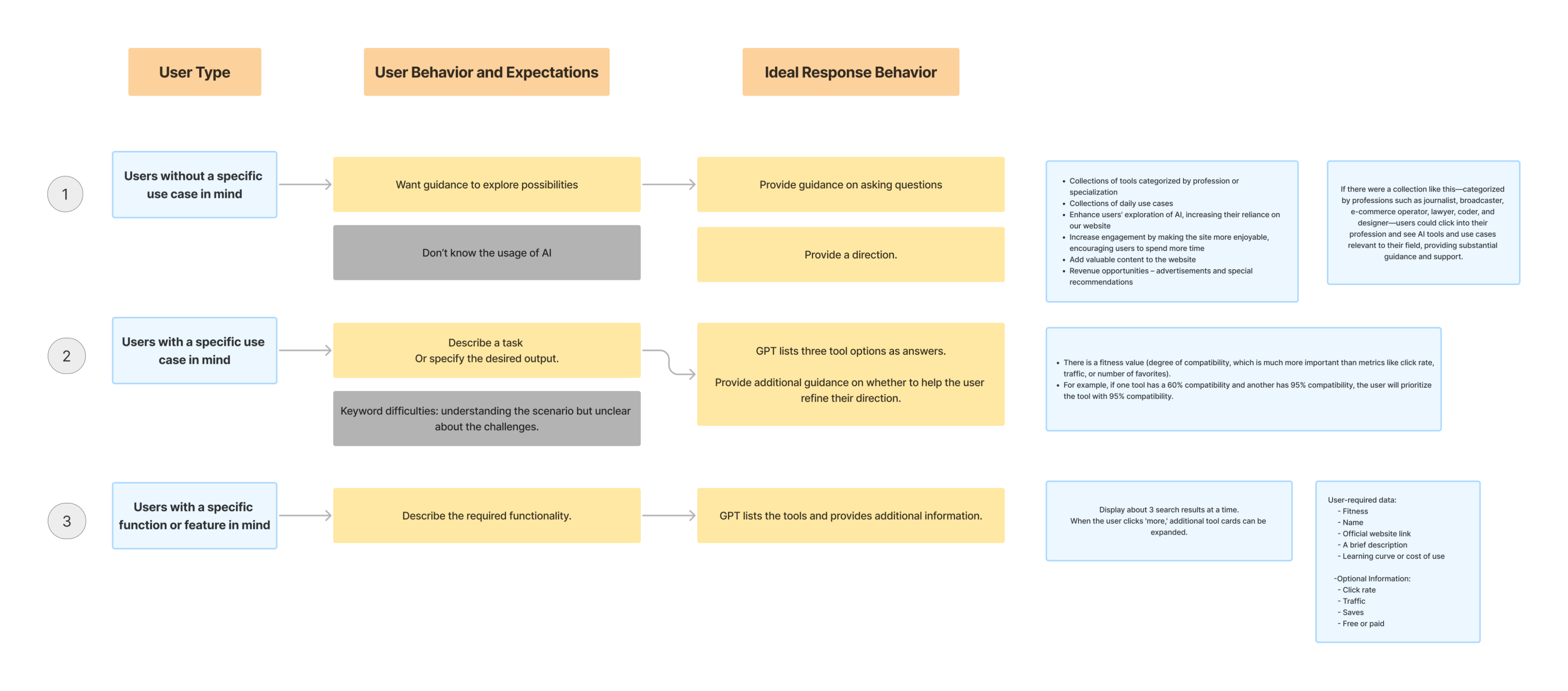
From these scenarios, it became clear that the product needed to support multiple entry points: exploration without a clear goal, task-driven discovery, and feature-specific queries.
I translated these needs into an information architecture that balanced flexibility with clarity, ensuring AI-driven suggestions were at the heart of the experience.
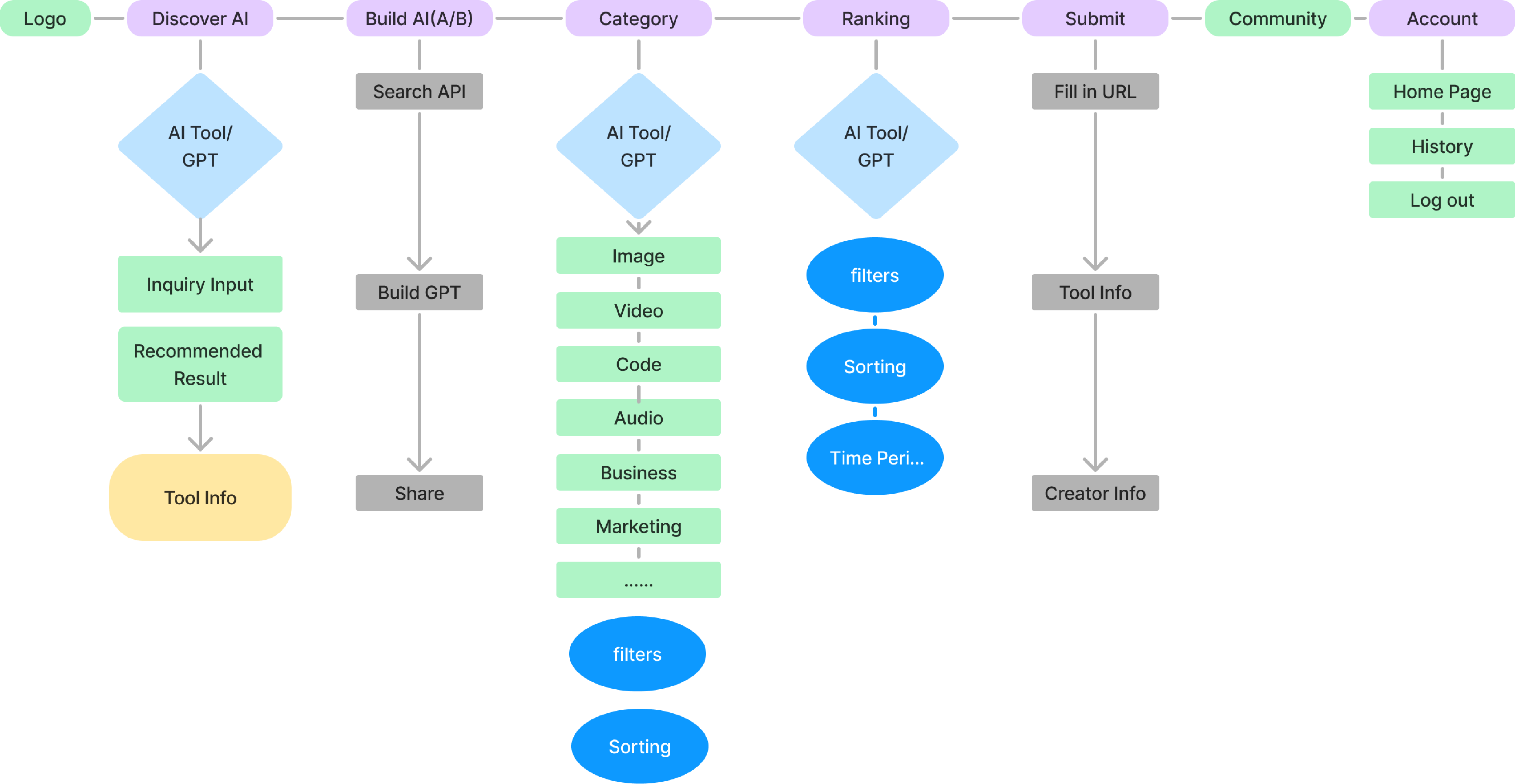
1.5 — Information Architecture
While defining the value story, I also Interviewed a few potential users recruited from huggingface and LinkedIn—mainly engineers familiar with evaluating new models.
II. Design Iteration
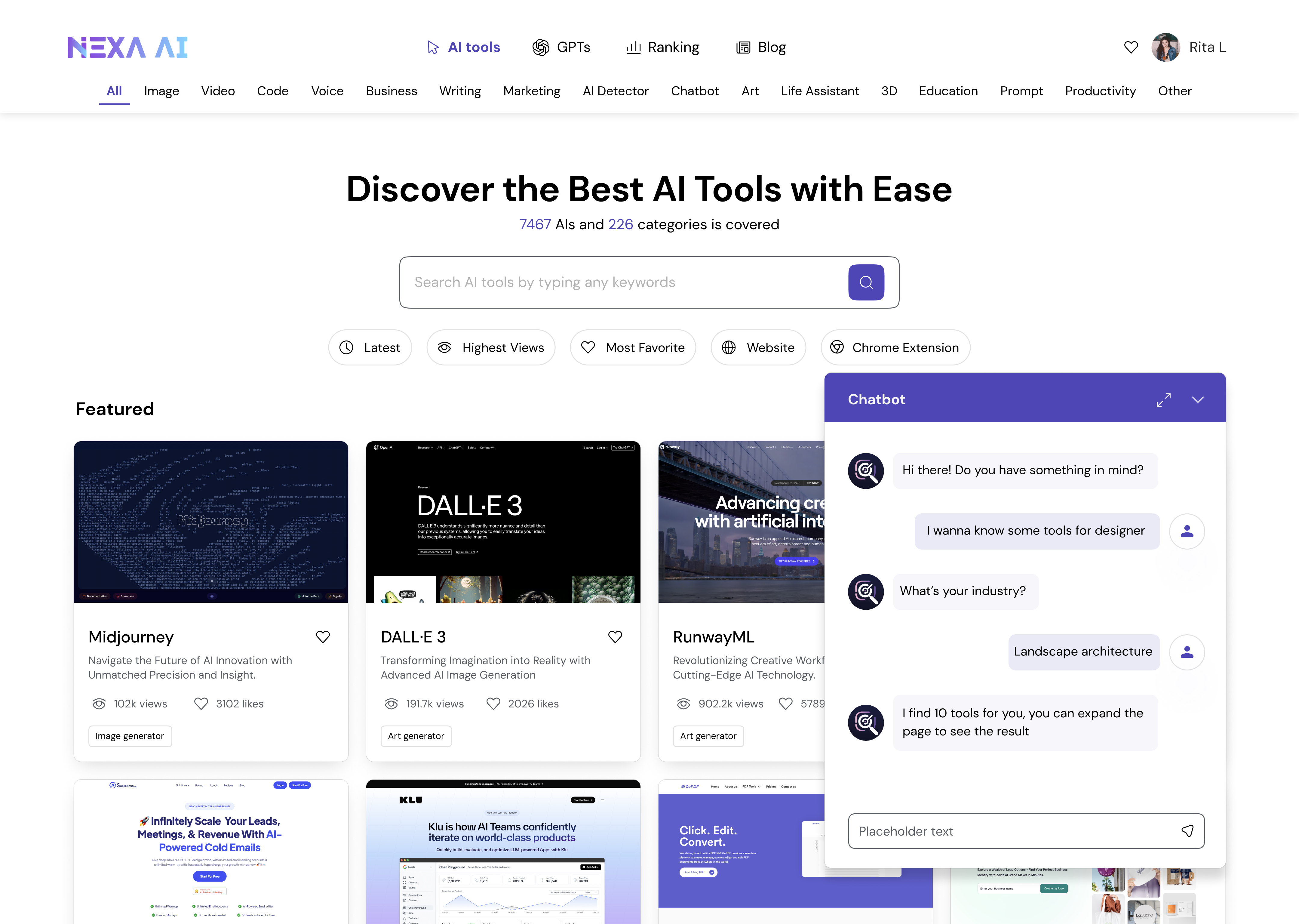
2.1 — Overall Layout & Searching
Left-Right
Side-Docked AI Suggestions Panel
Search-First + Conversational AI
Search-Enhanced AI + Result Feed
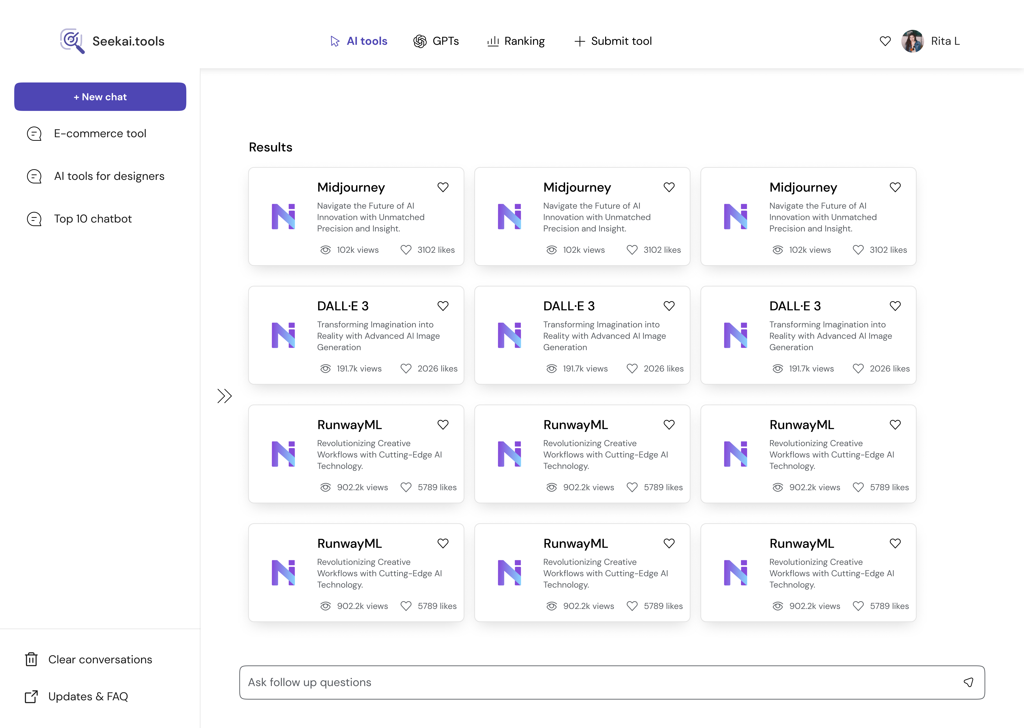
Top-Bottom
Vertical Stack: Conversational Search
Search Bar with Inline History + Card Feed
Guided Search: Category Prompts + Result
Full Screen
More Preset Prompt Launcher
Search Expectations & Category Prompts
Three-Panels: Output + Contextual Cards
Other
Inline Search Cards Within Conversation
Persistent Bottom-Right Hover Agent
Card-Only Mode for Max Result Density
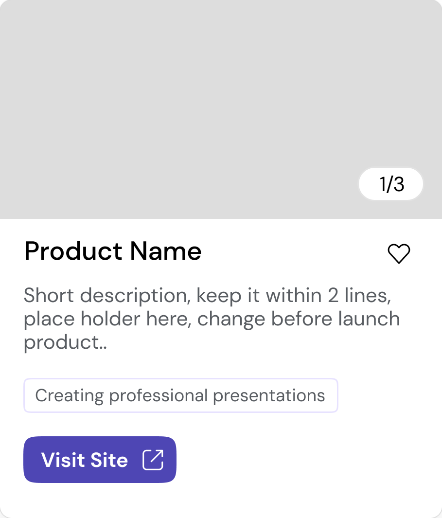
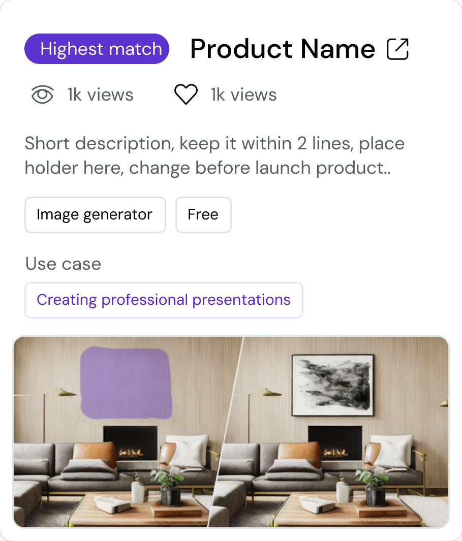
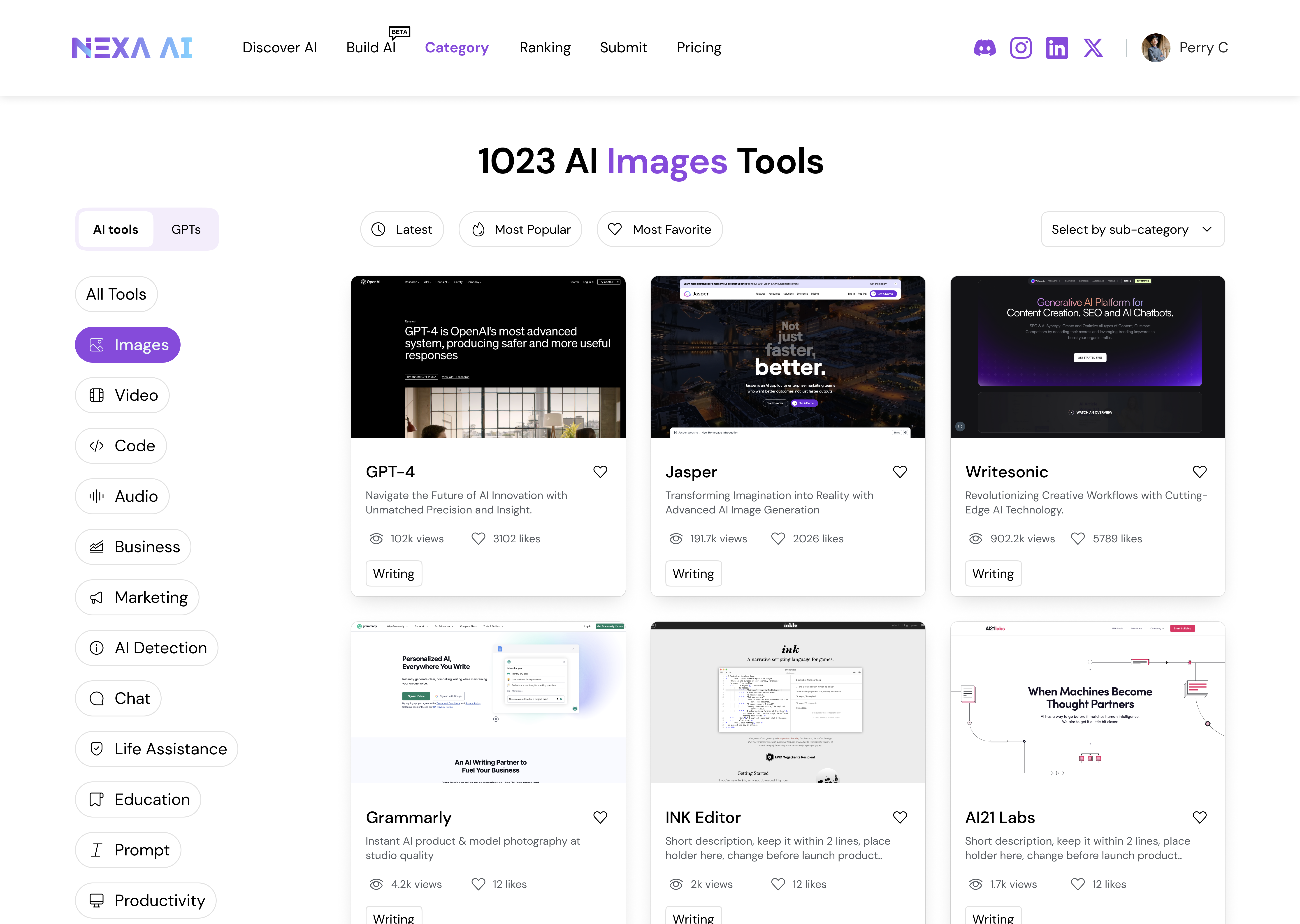
2.2 — Information Card
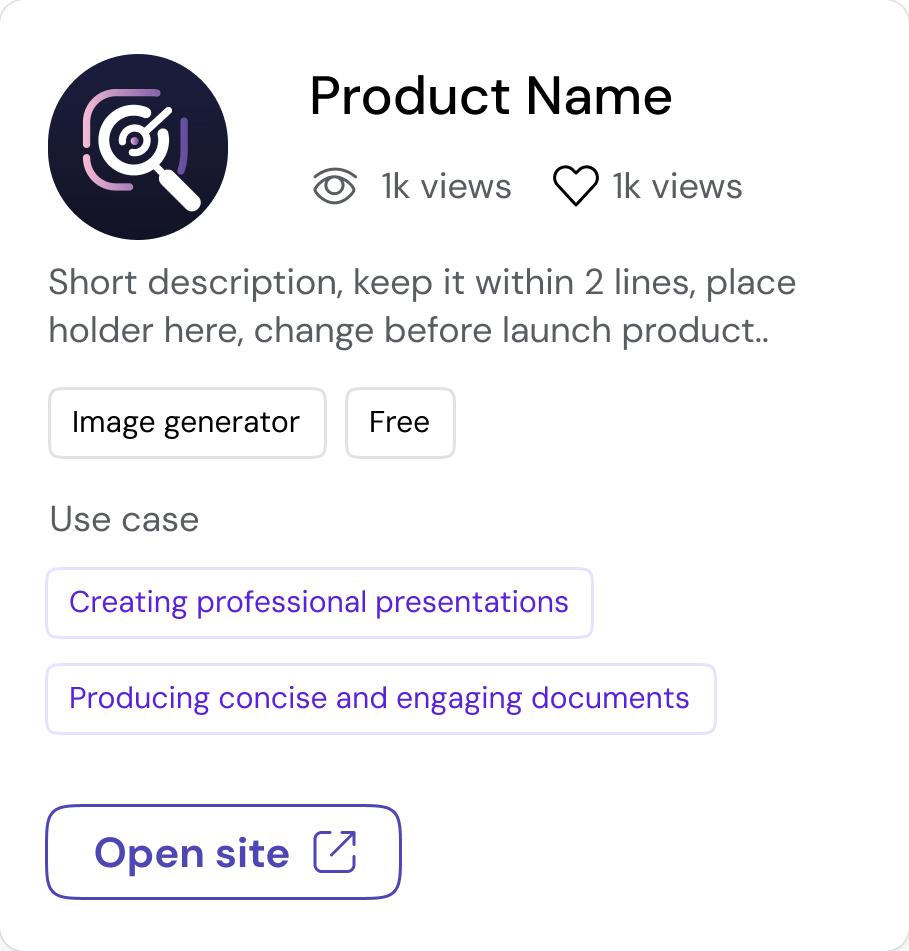
Minimal Avatar-Led Summary Card
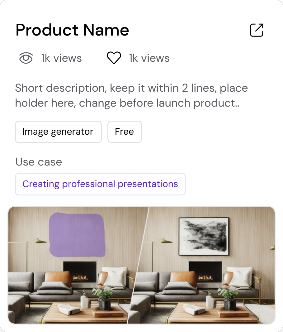
Visual-Rich Discovery Card
Direct-Access, Action-First Card
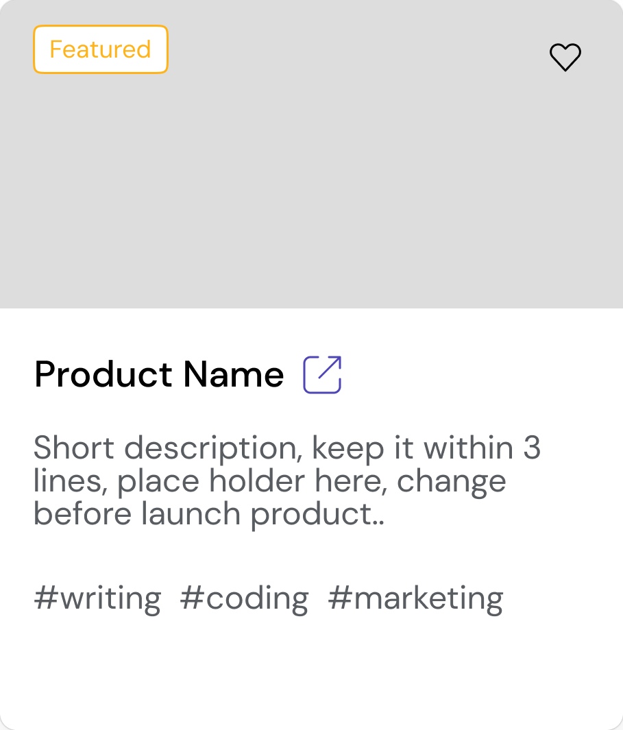
Editorial-style card
Relevance-driven Comparison Card
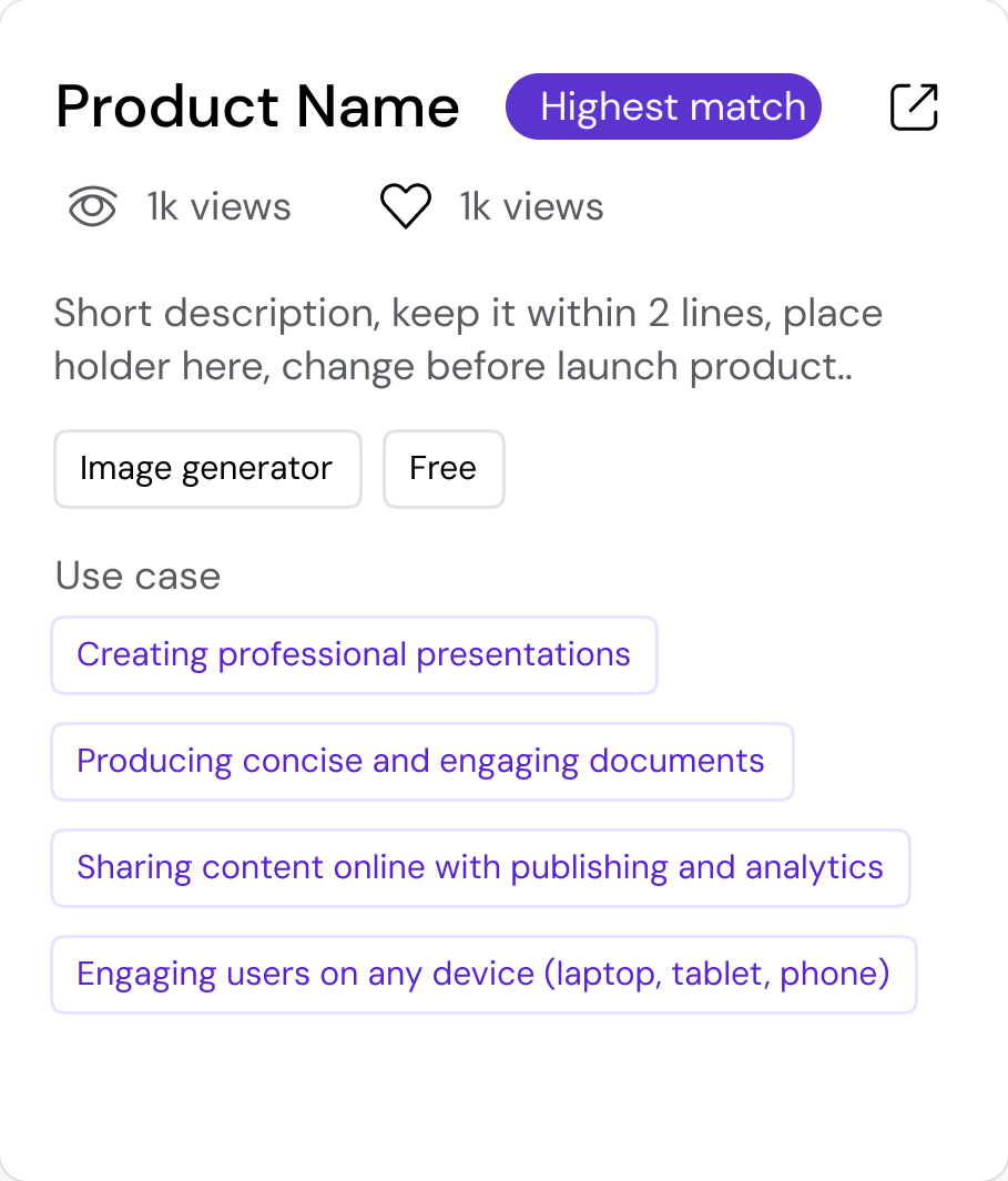
Use Case Driven Card
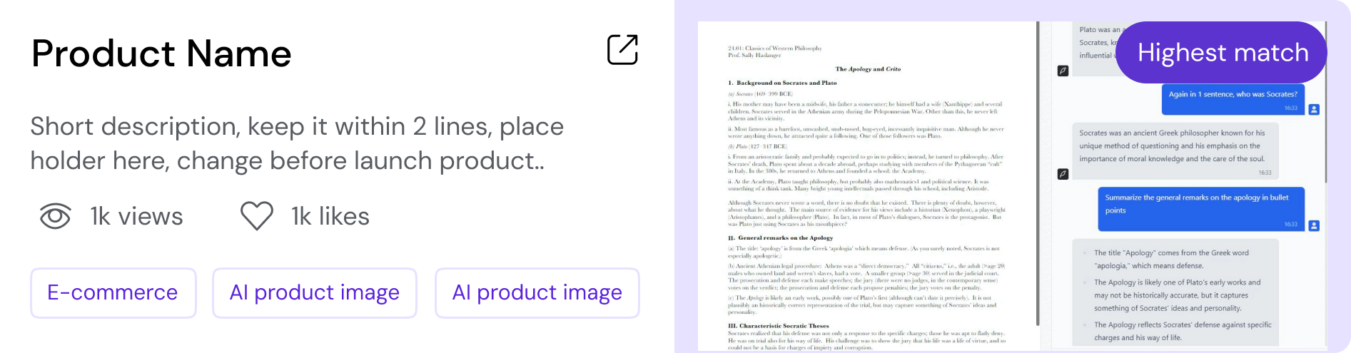
Horizontal Version balances both Info & Visual
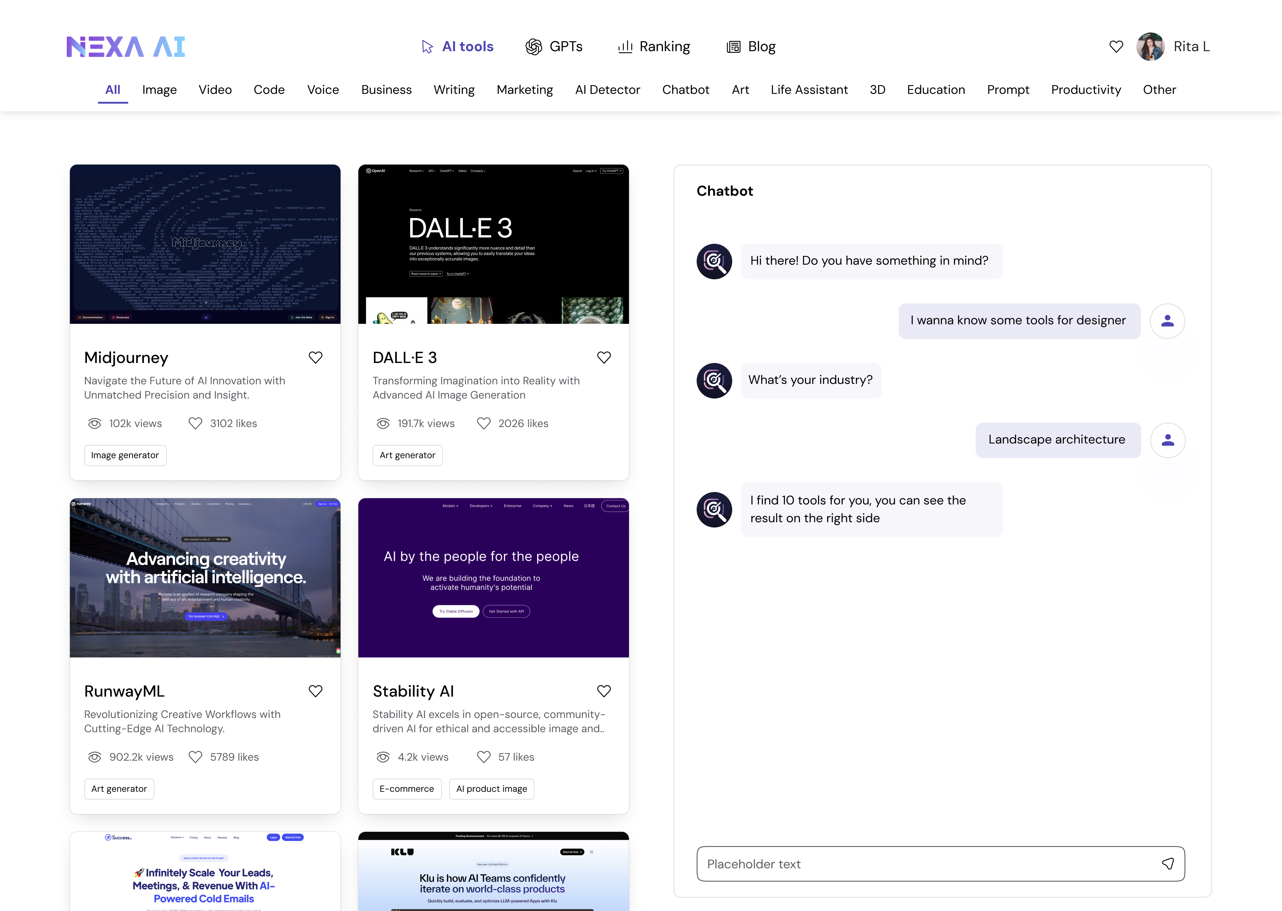
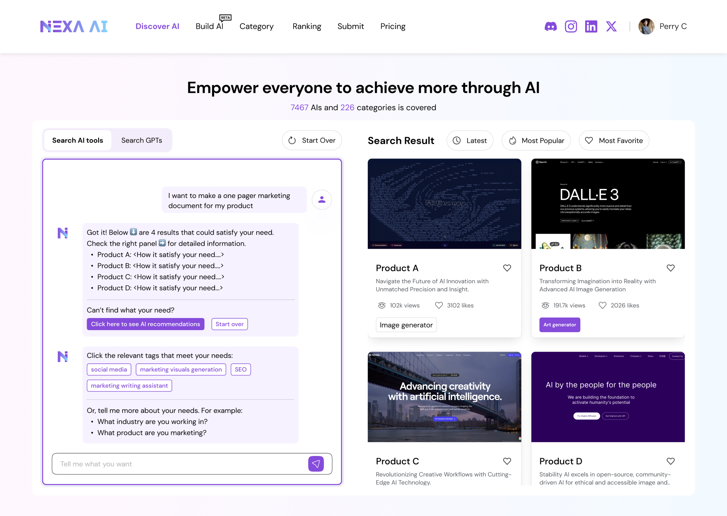
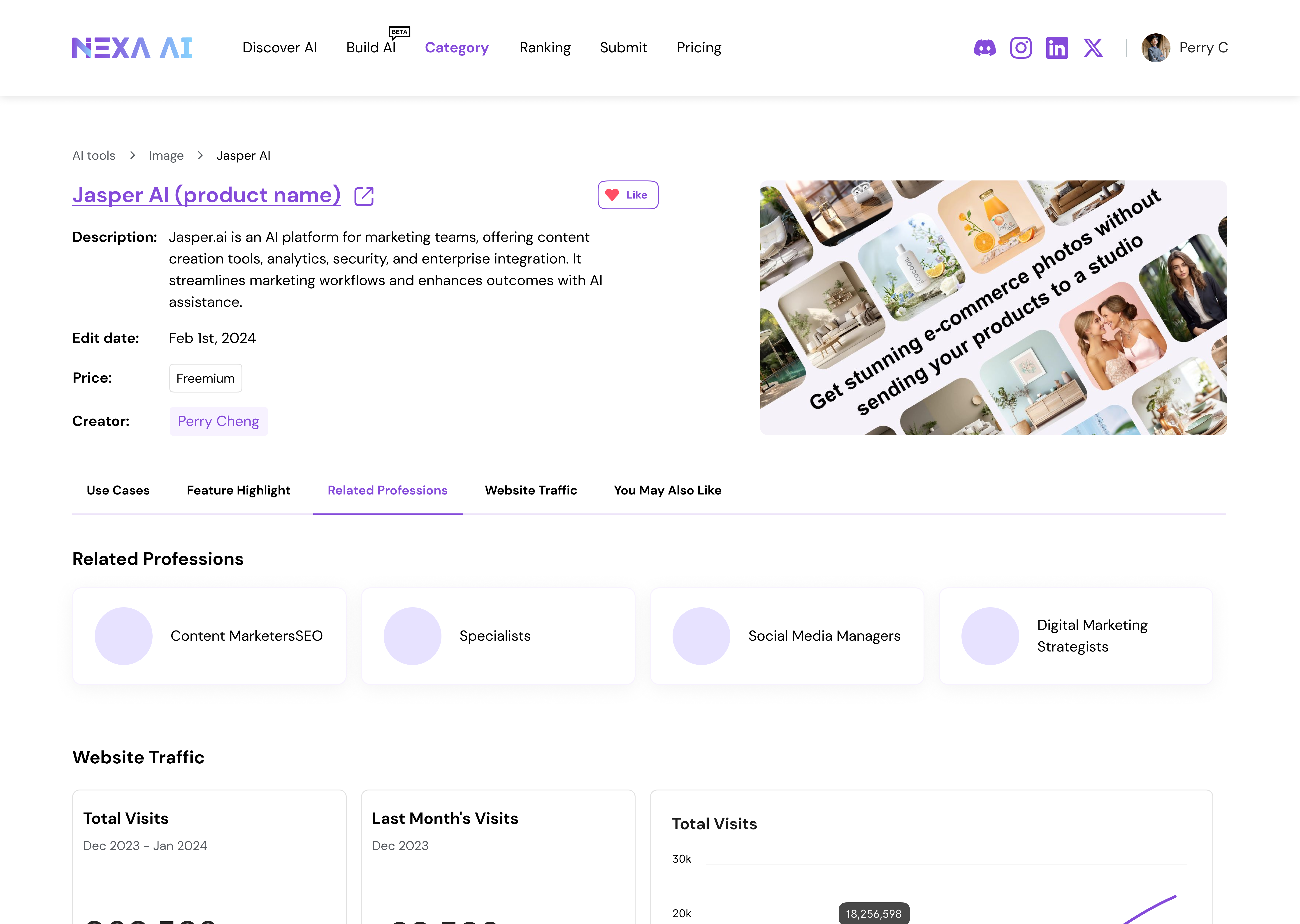
2.3 — Final Design
After exploring multiple layout and card variations, while visually rich and conversational layouts improved engagement during exploration, they introduced unnecessary cognitive overhead for search-driven tasks and were intentionally deprioritized in the final design.
We finally landed on a search-first design that surfaces sufficient, decision-ready information while intentionally minimizing visual distraction.
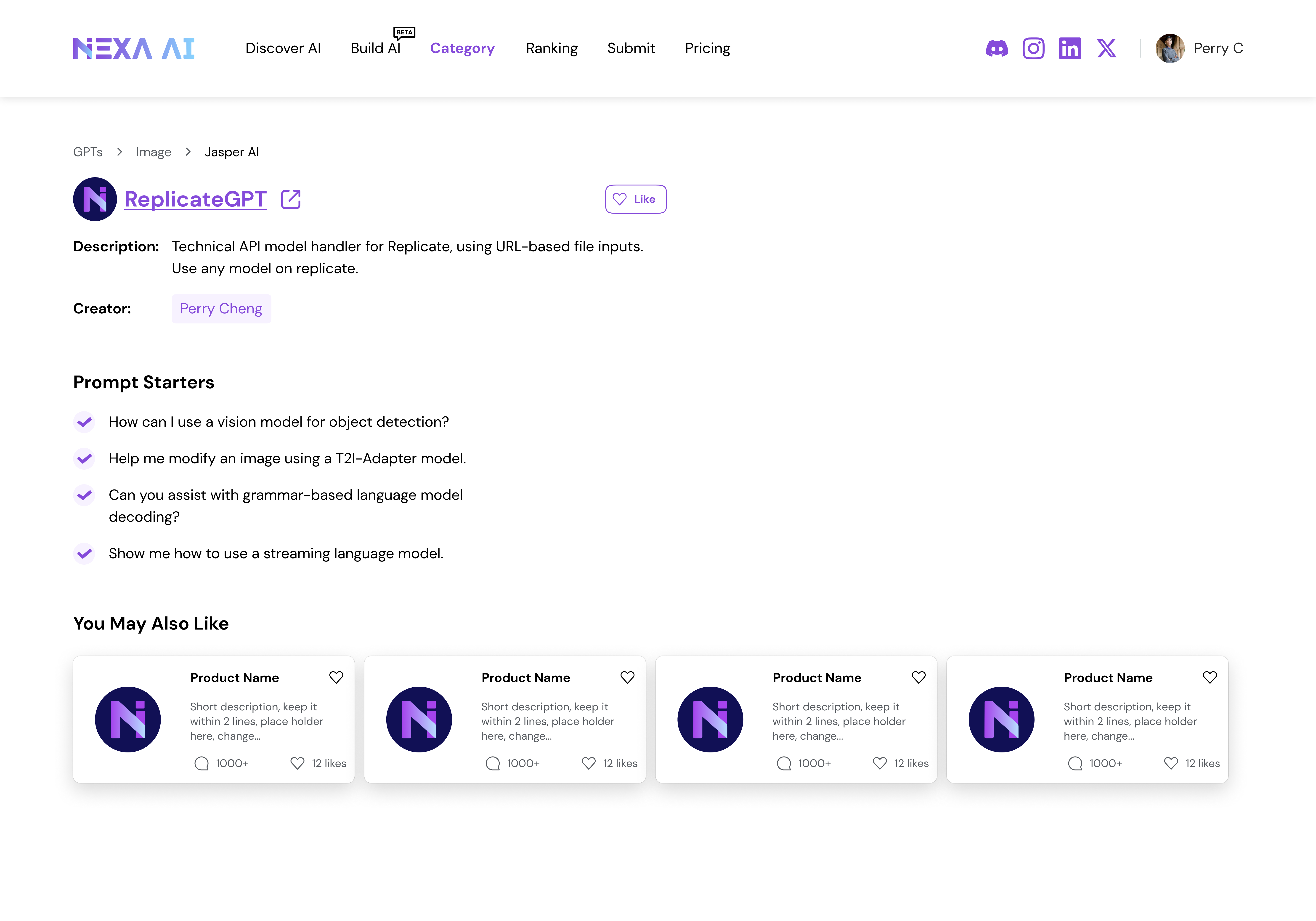
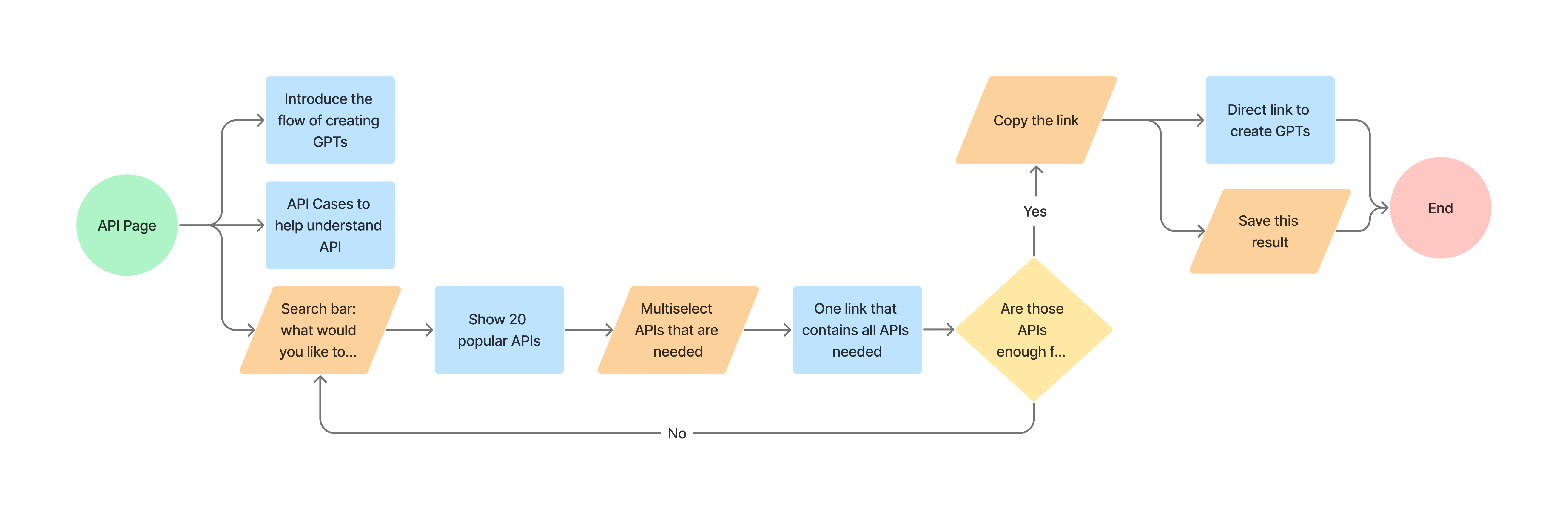
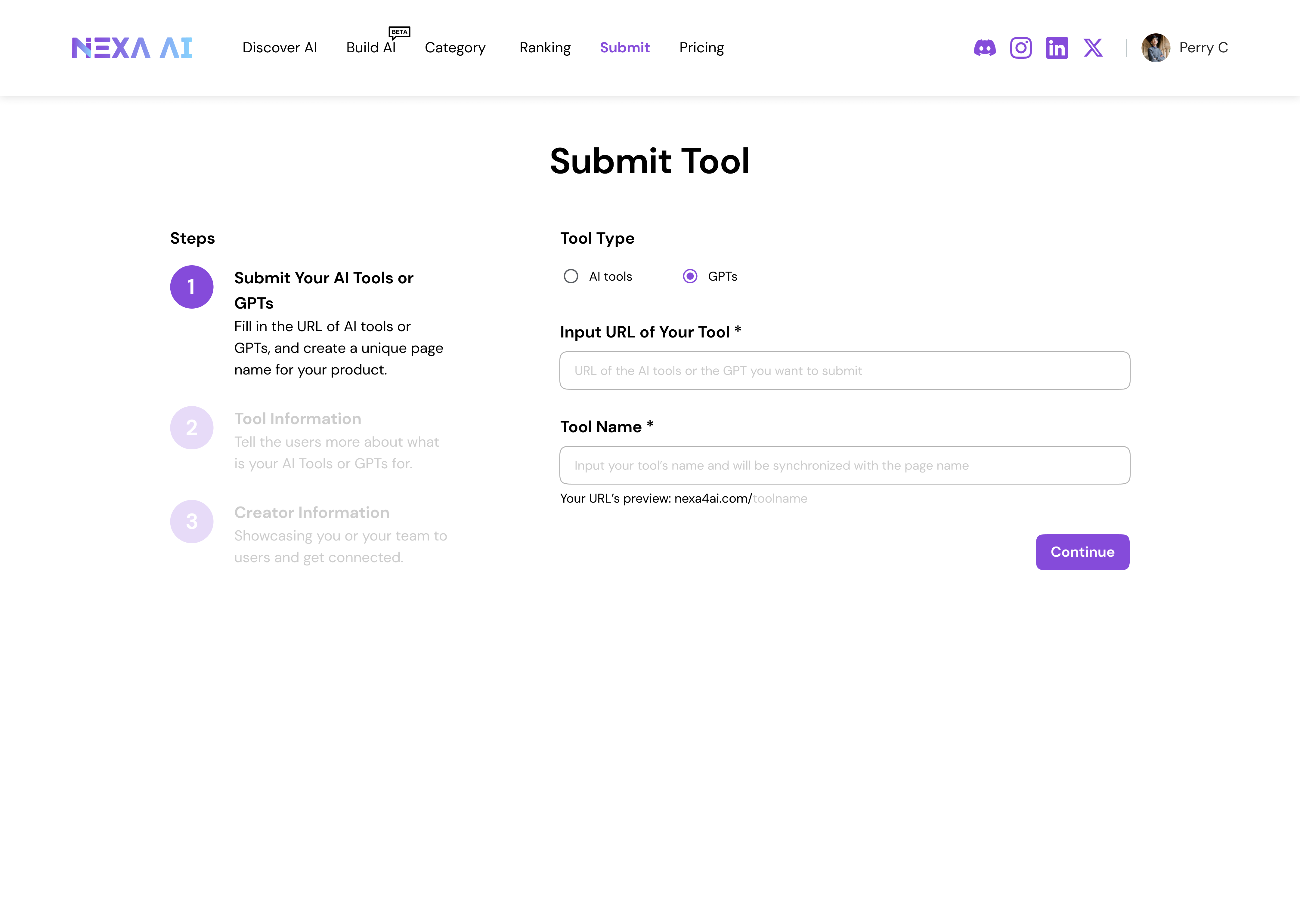
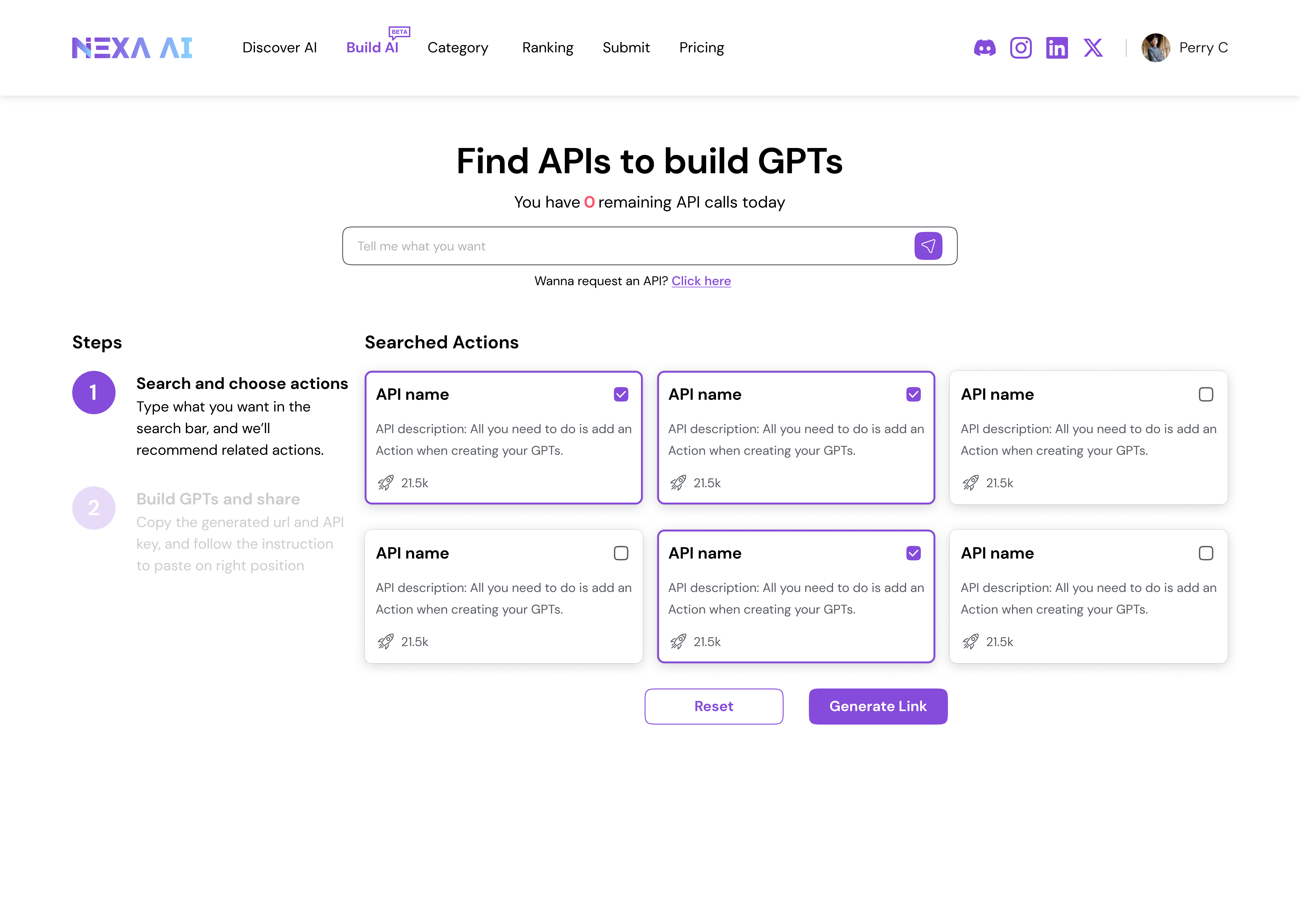
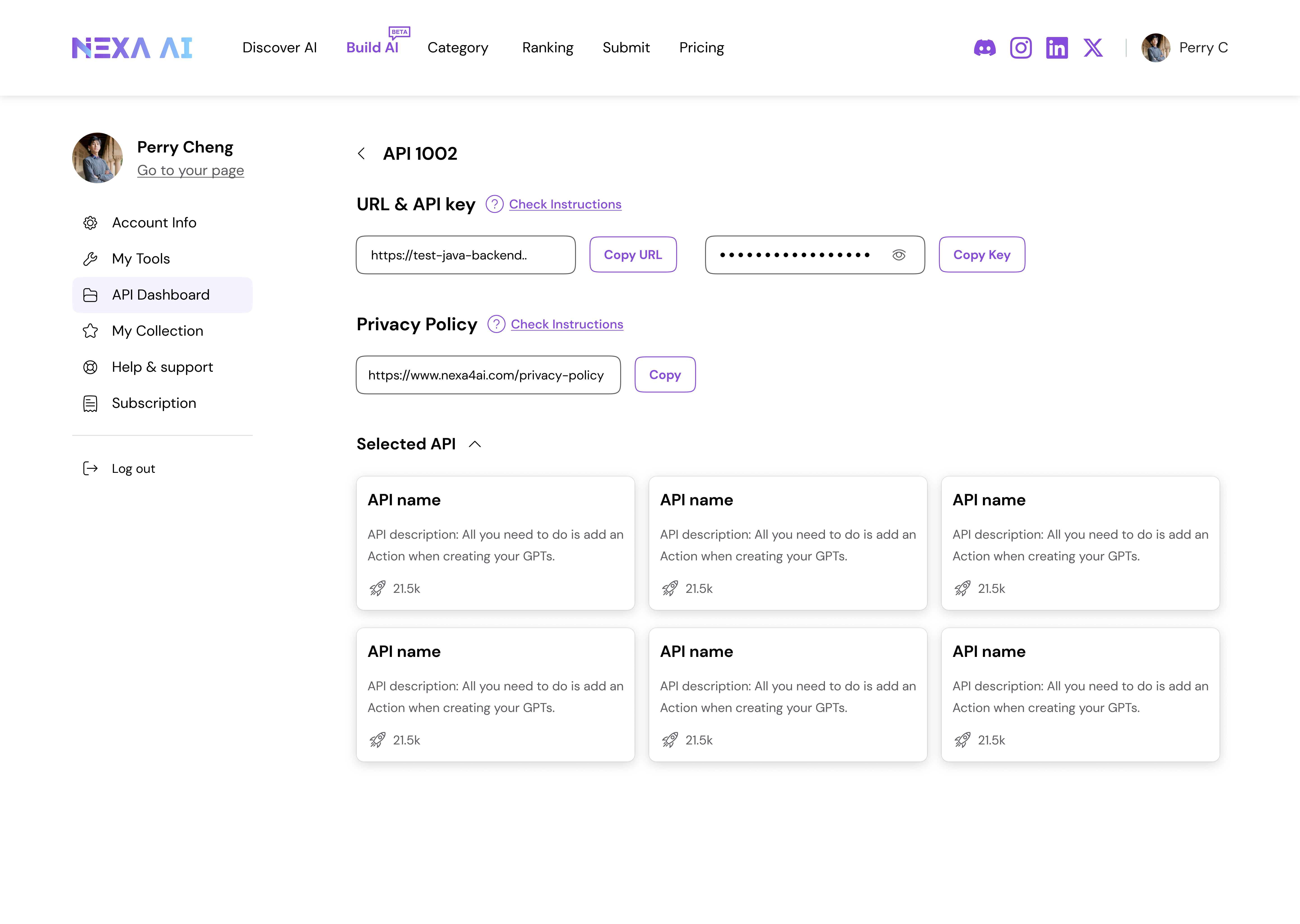
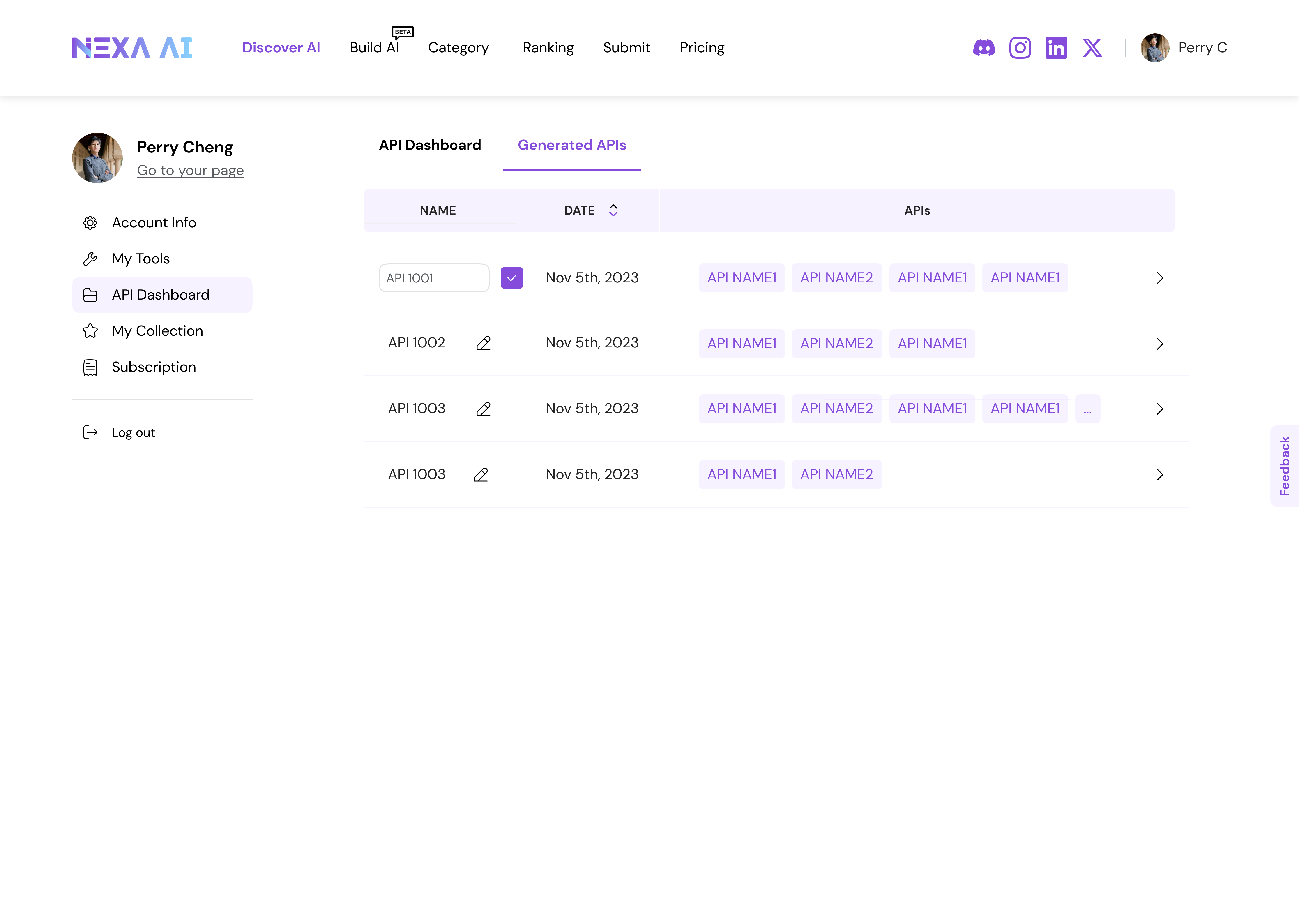
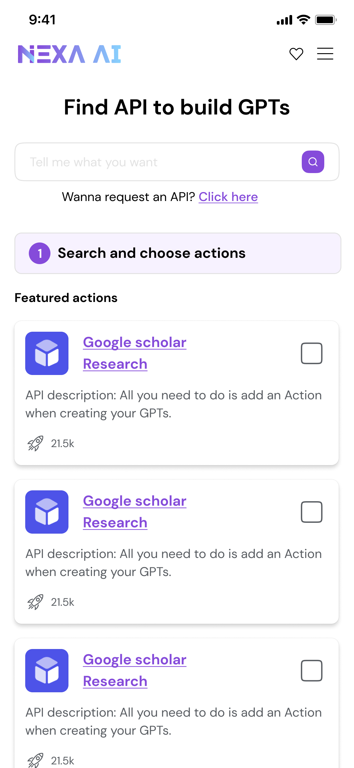
3.3 — Downloadable API Packages for Advanced Users
Why? While full-developed tools meet most discovery needs, advanced users often require deeper control, composability, and integration into existing workflows.
Reflection & Next Steps
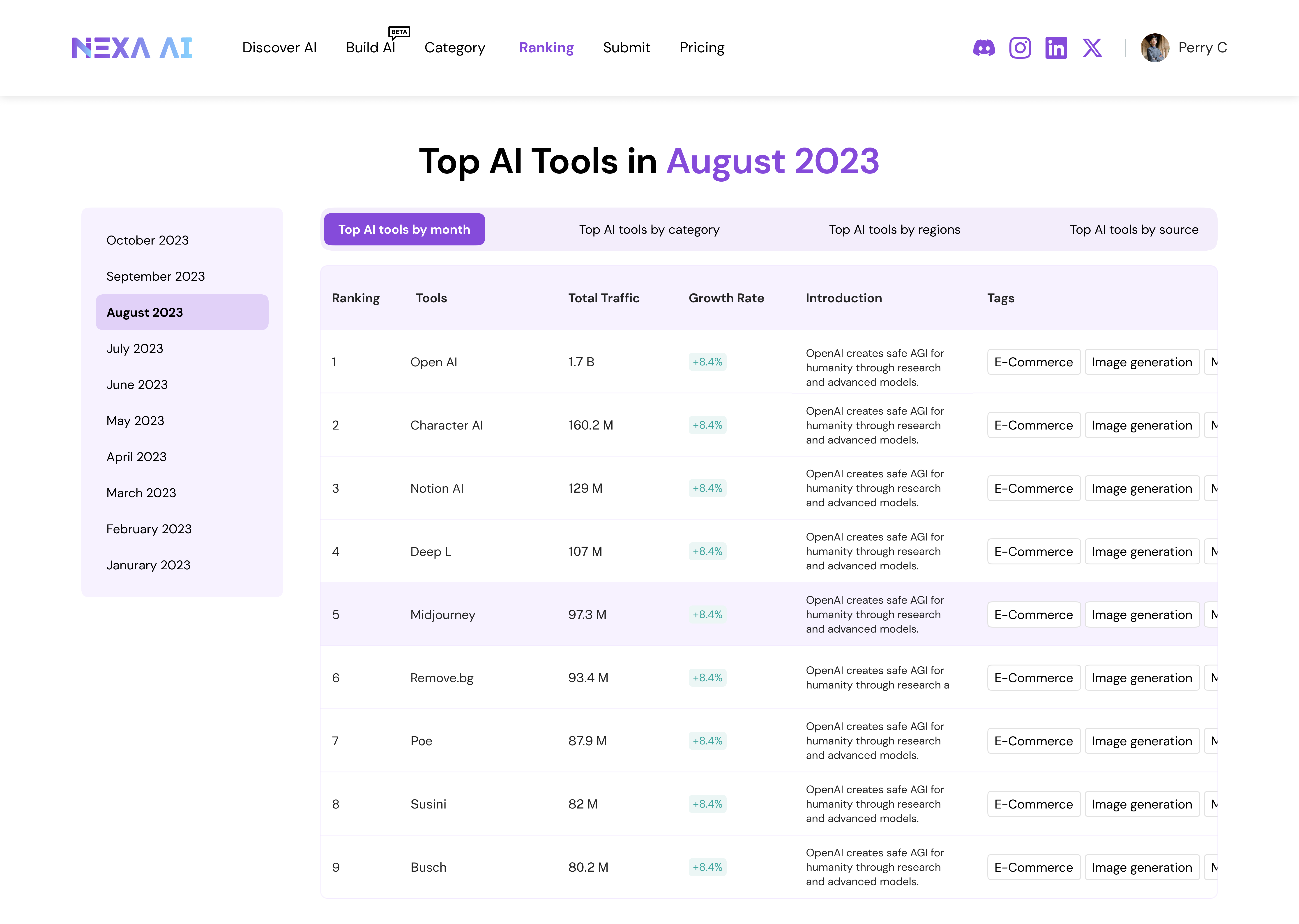
Results & Impacts
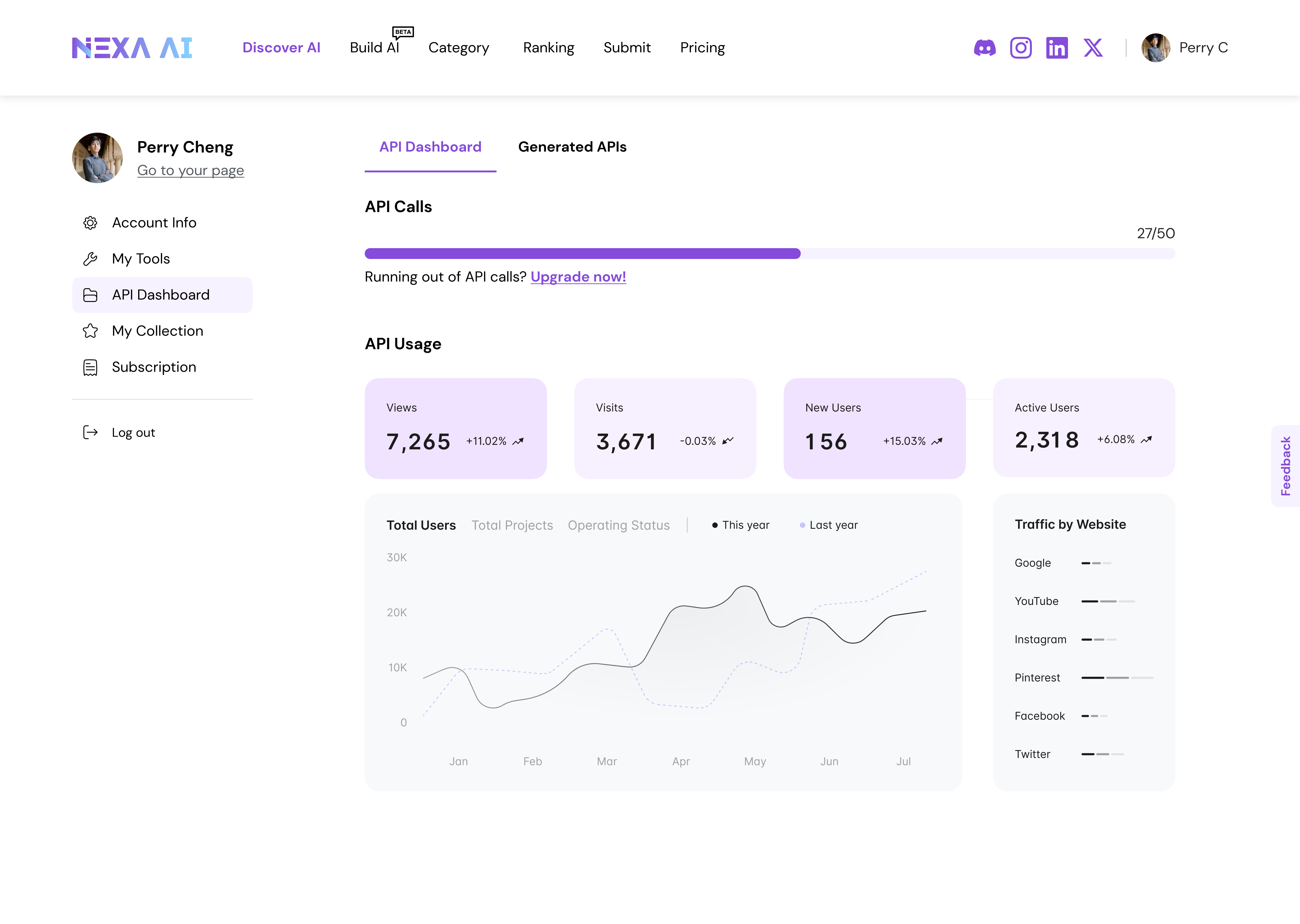
The platform operates at meaningful scale, providing real-world constraints and validation context for design decisions.
5M+ monthly visits with a balanced desktop and mobile audience
3+ minutes average visit duration, indicating sustained engagement
4.2 pages per visit, reflecting multi-step exploration behavior

As we can see frome the analysis, over 60% of our user used mobile to access. Based on this, we improved the mobile end responsive design.
Thoughts
One key reflection was recognizing when to stop optimizing individual interactions and start designing for system-level sustainability.
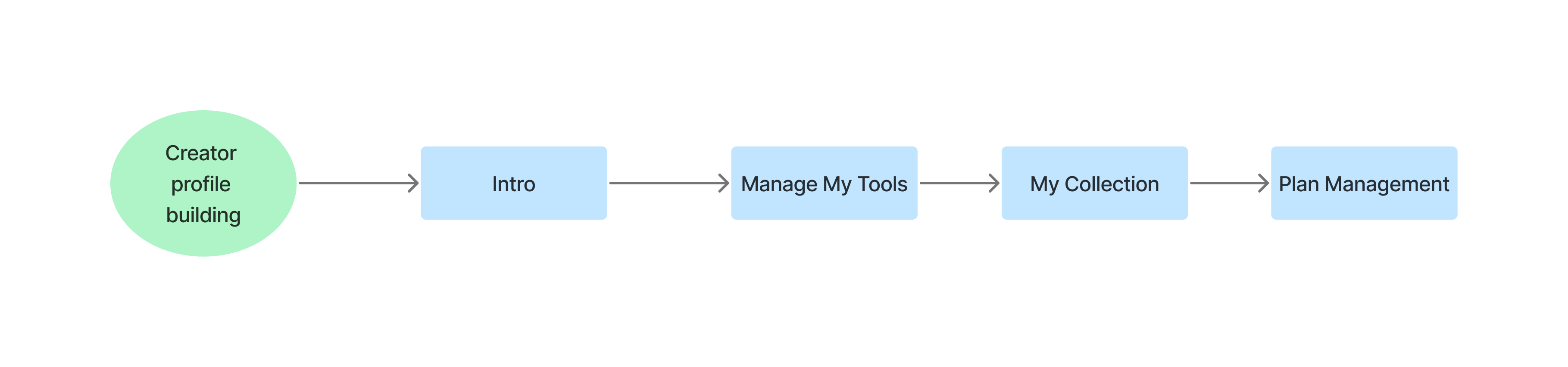
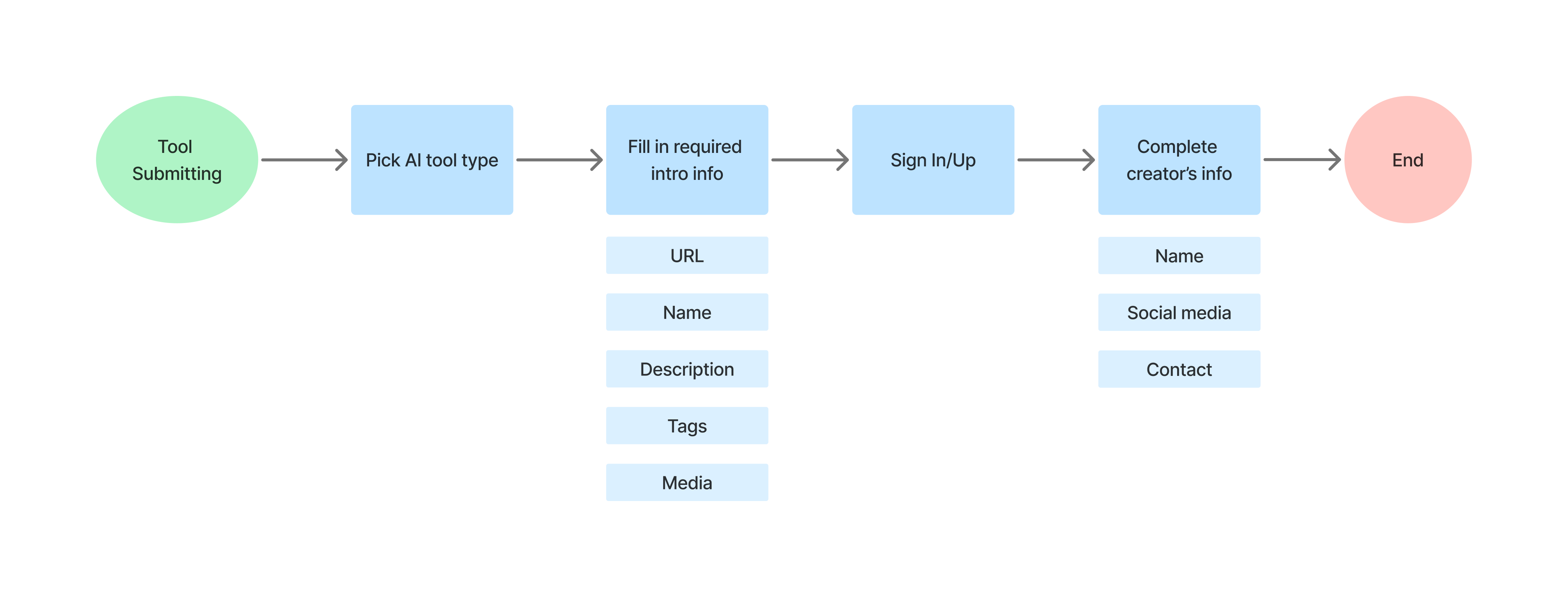
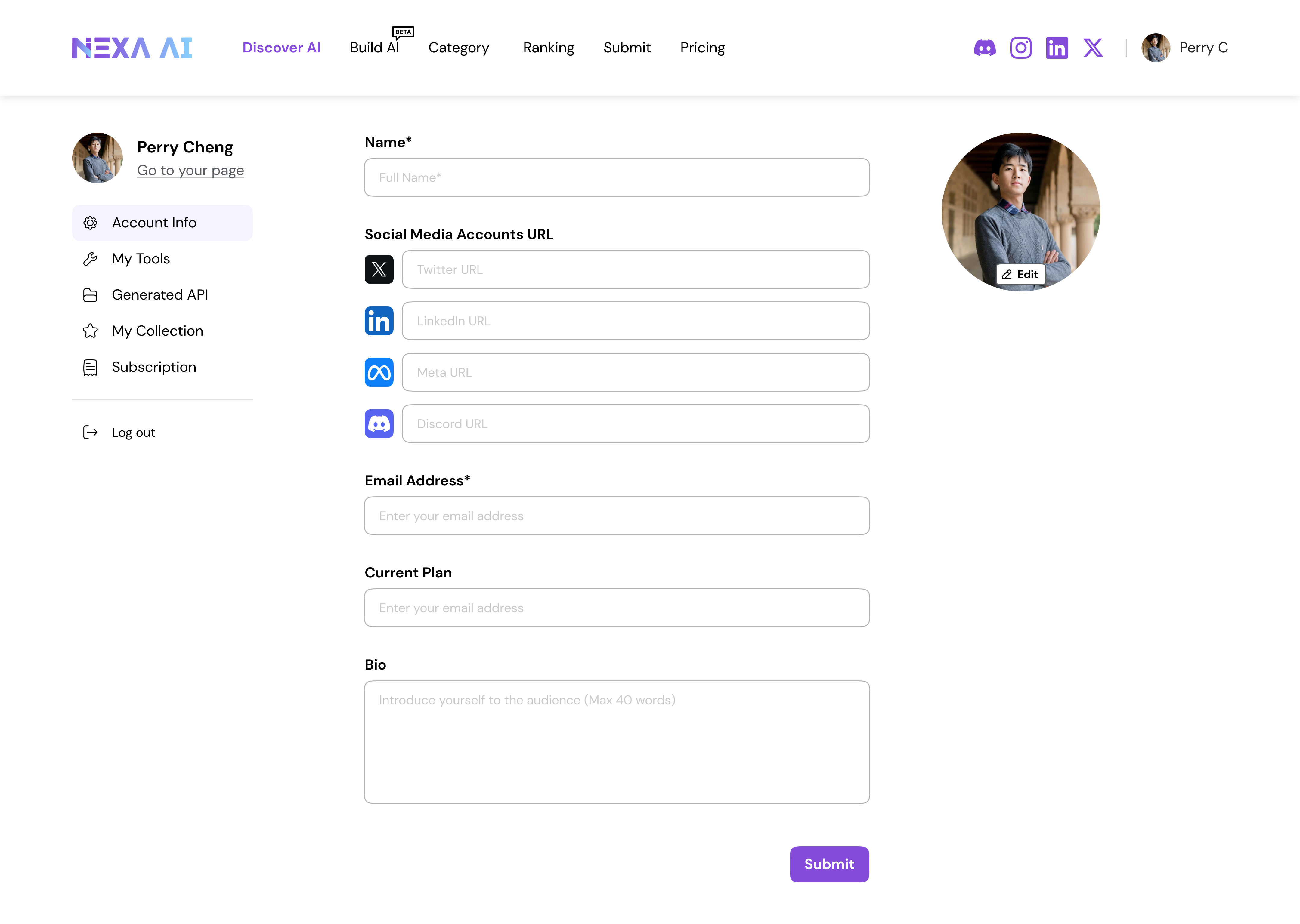
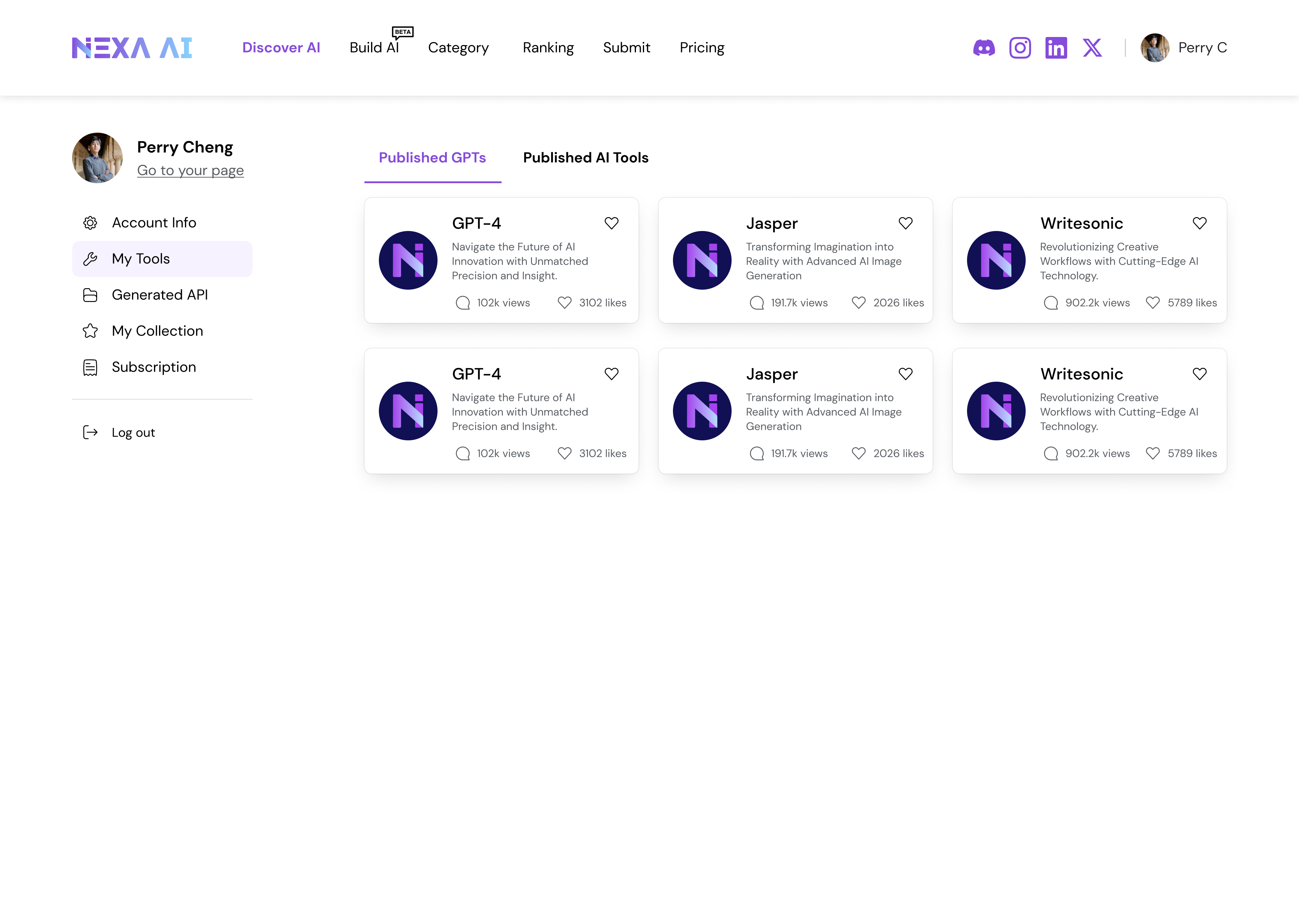
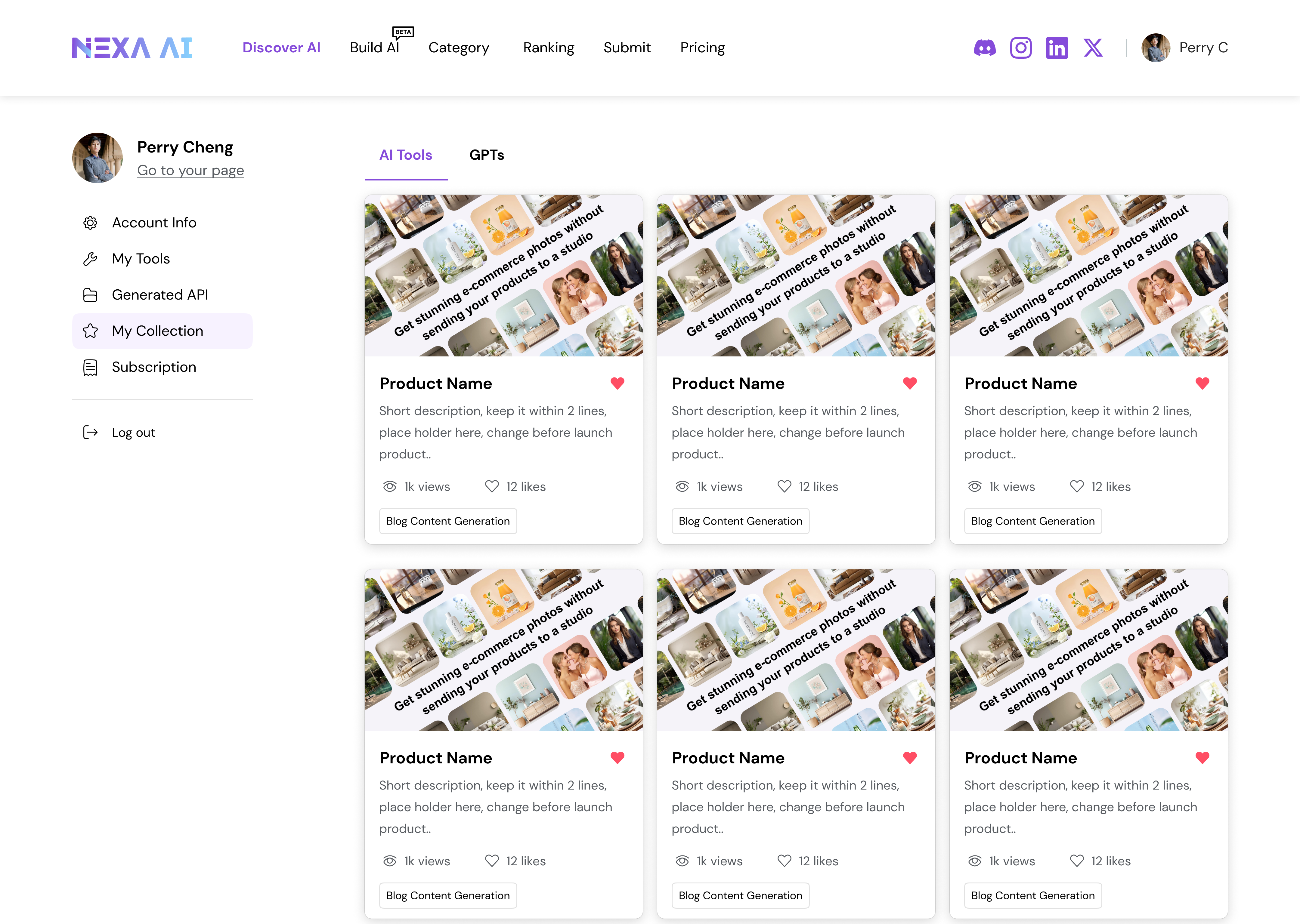
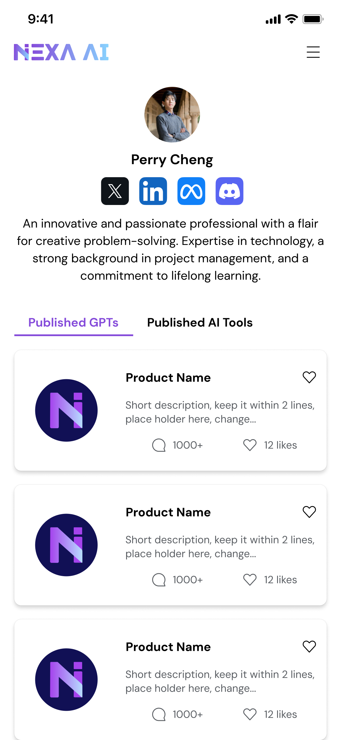
Establishing a search-first foundation clarified user intent and reduced cognitive load, but long-term value depended on enabling identity, contribution, and advanced usage beyond search.By introducing public creator profiles, creator submissions, and API packages, the platform shifted from passive aggregation toward an ecosystem that connects creators, users, and expert workflows.
If continued, the next phase would focus on validating these platform extensions through creator engagement metrics, API adoption signals, and behavioral indicators of long-term retention—while carefully managing the trade-offs between simplicity, governance, and scalability.
This is some text inside of a div block.

