DrayEasy Web App redesign
DrayEasy Order Management Redesign
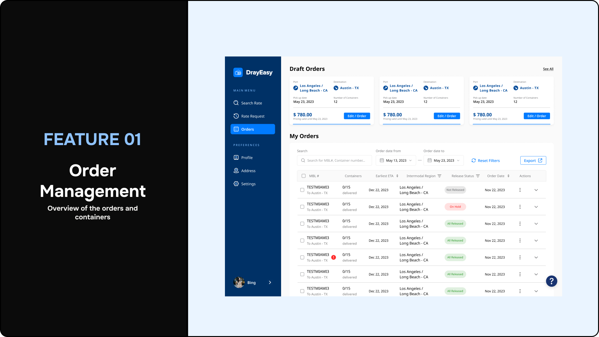
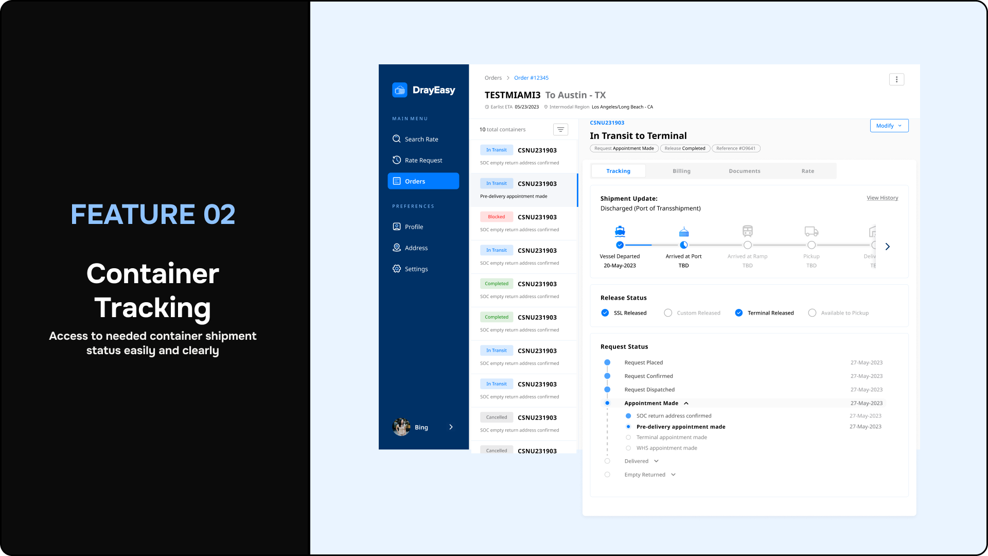
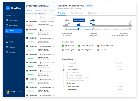
Final Solution
Based on the conclusions from our research, we redesigned the entire interface flow from order management to container tracking, effectively
addressing the needs of the stakeholders.
Research
Lorem ipsum dolor sit amet, consectetur adipiscing elit ectus mattis nunc aliquam tincidunt est non viverra nec eu, in ridiculus egestas vulputate tristique.
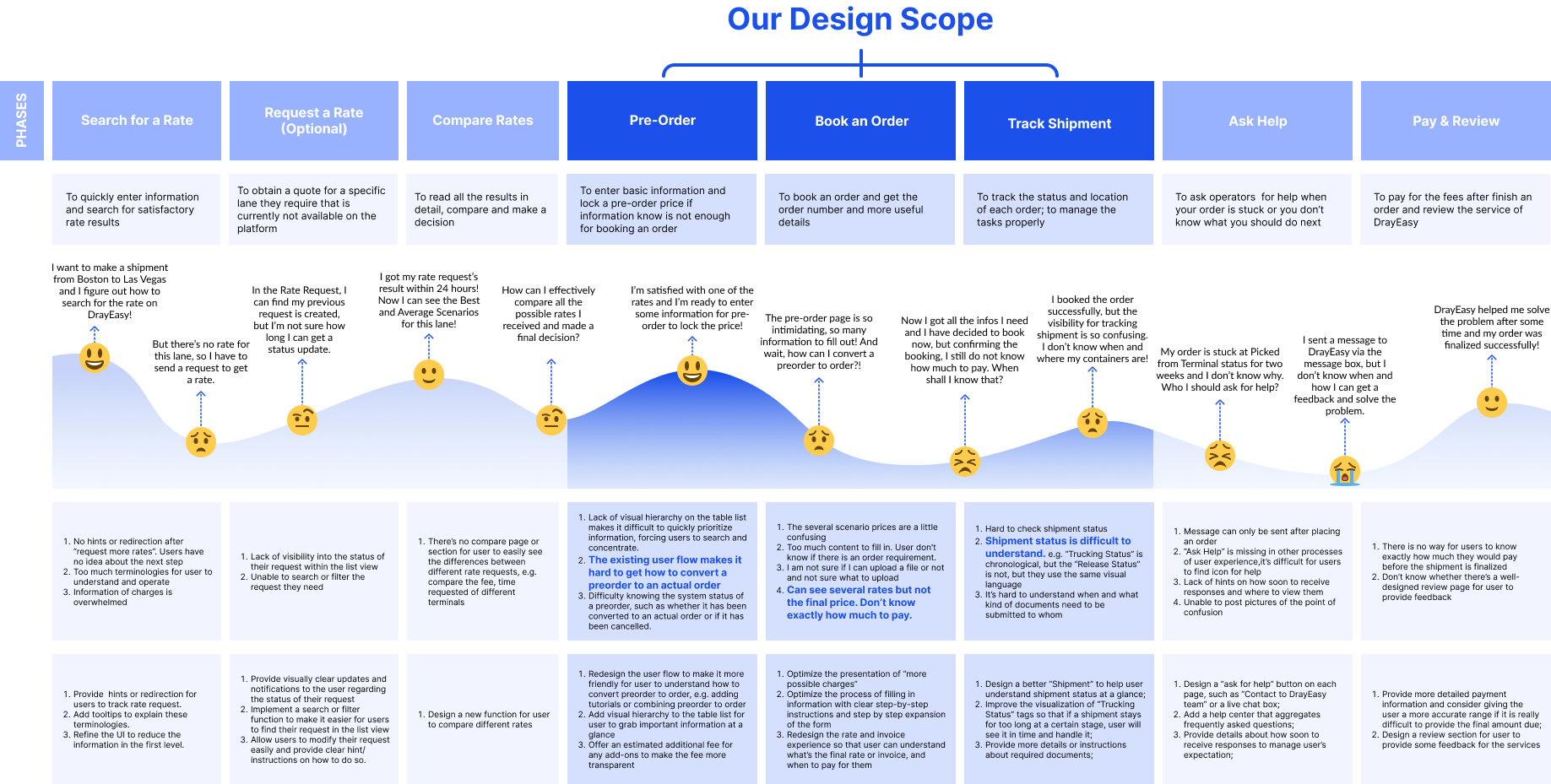
Product critique

01 Redundant user flow
02 Overwhelmed information
03 Frustrating information architecture
Journey Map
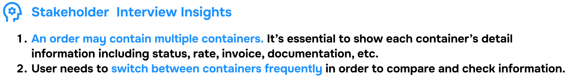
Interview Insights
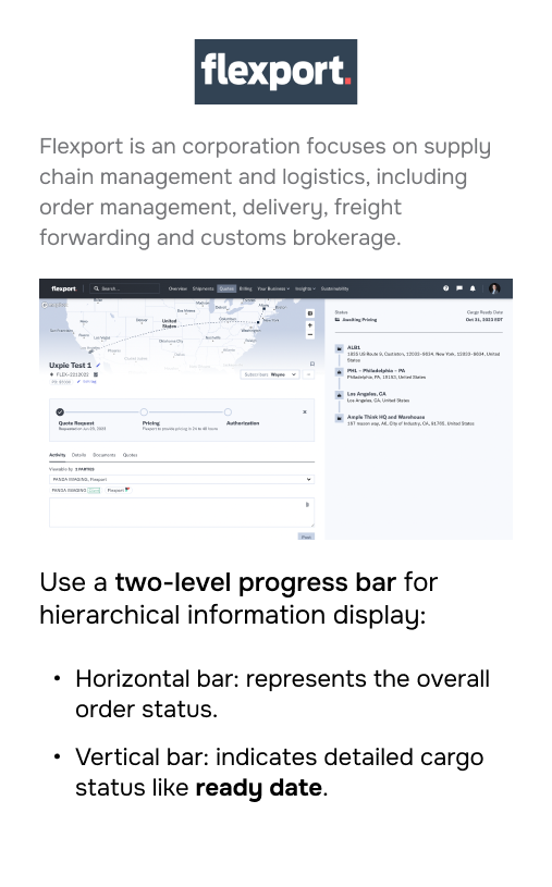
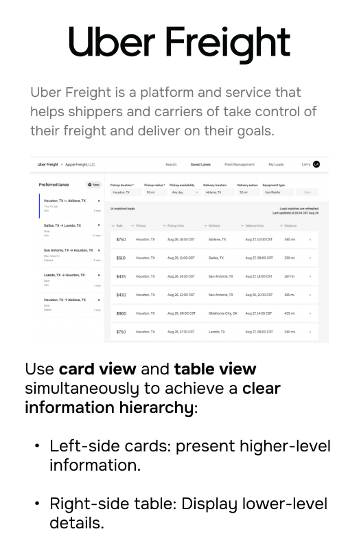
Competitor Analysis
Interview Insights

Design Process
Lorem ipsum dolor sit amet, consectetur adipiscing elit ectus mattis nunc aliquam tincidunt est non viverra nec eu, in ridiculus egestas vulputate tristique.
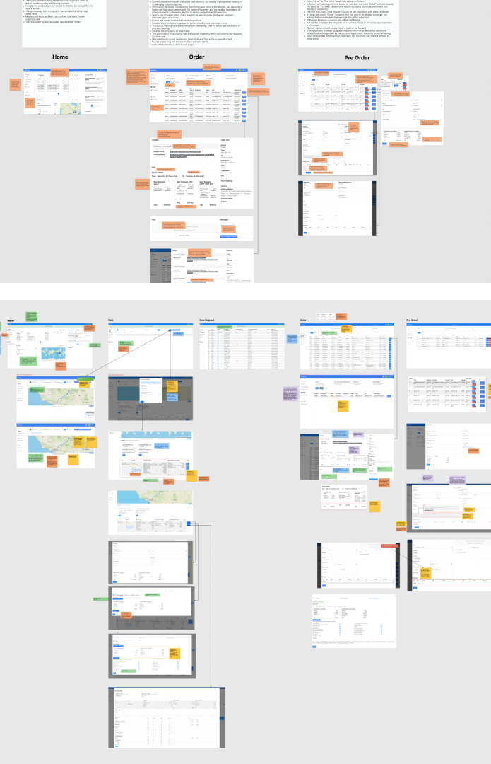
Ideation Wireframe
Exploration Order
Exploration Container
Modal
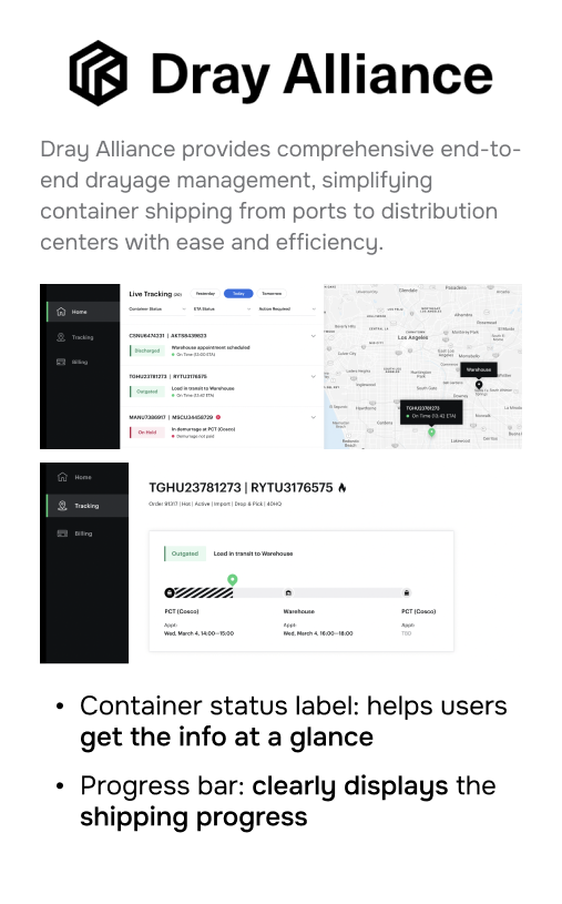
-Clear display of container information
-Quick switching between container and order pages.
Cons:
-Space limitations
Intrusiveness
Don’t allow arbitrary switch among containers.
Full Screen
-More space for more info display.
-Easy and clear navigation.
Cons:
-Unable to switch between containers.
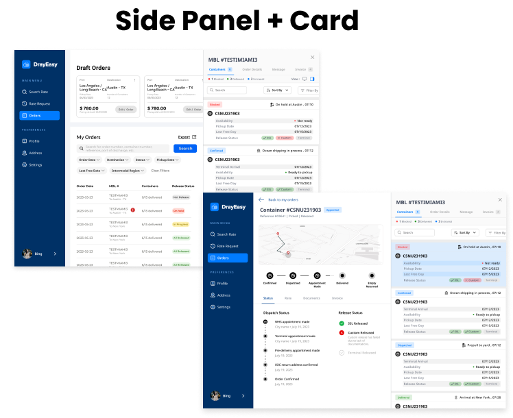
Slide-Out
Achieve fast return to the order page.
Can still see part of the order page.
Cons:
Space limitations
Seeing the order page can be distractive.
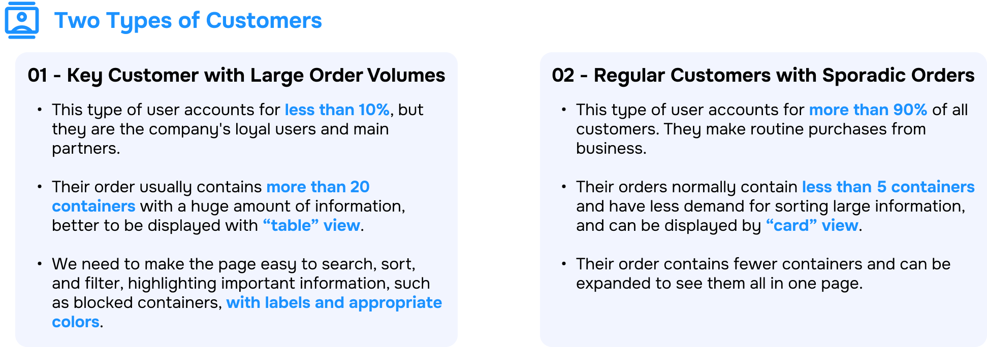
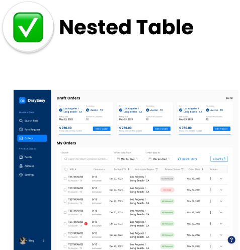
Card List + Tab
-Able to see status difference between containers. Meeting the type1 customers’ requirements.
-Able to see both shipment and request status through the list.
-Can show more containers.
-Support arbitrary switch.Easy and clear navigation.
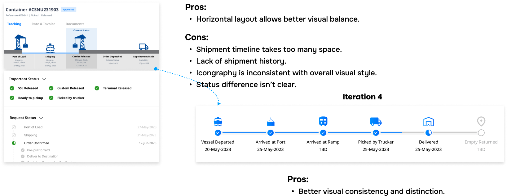
Iterations Tracking
Initial UI
Iteration 1
Iteration 2

.png)
-Enhance information hierarchy.
-Use more understandable terminology.
-Include more relevant container information.
-Reduce space occupied by events.
-Clarify relationships between statuses.
-Clear navigation on request status.
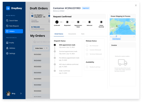
Cons:
-Request status and substatus appear unrelated.
-Didn’t display shipment information.
-Iconography fails to differentiate release status effectively.
-Hightlight and visualize shipment timeline through key events and dates.
-Better iconography for navigate and comparison.
Iterations Tracking
Iteration 3
Iterations Tracking
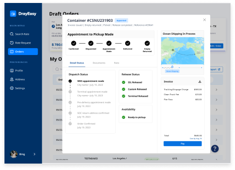
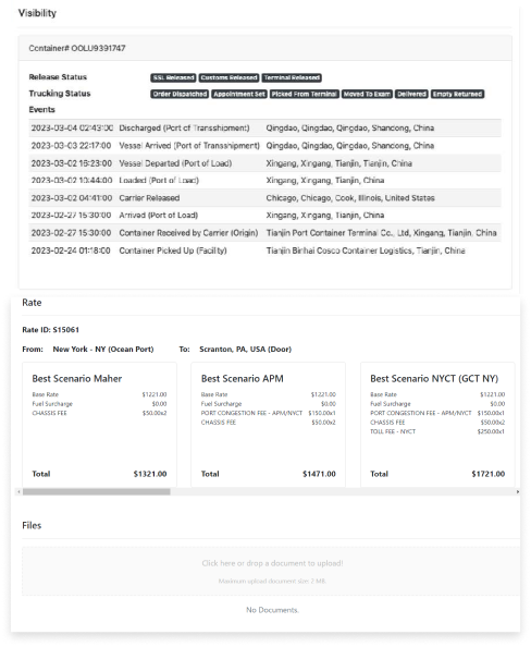
Final Design
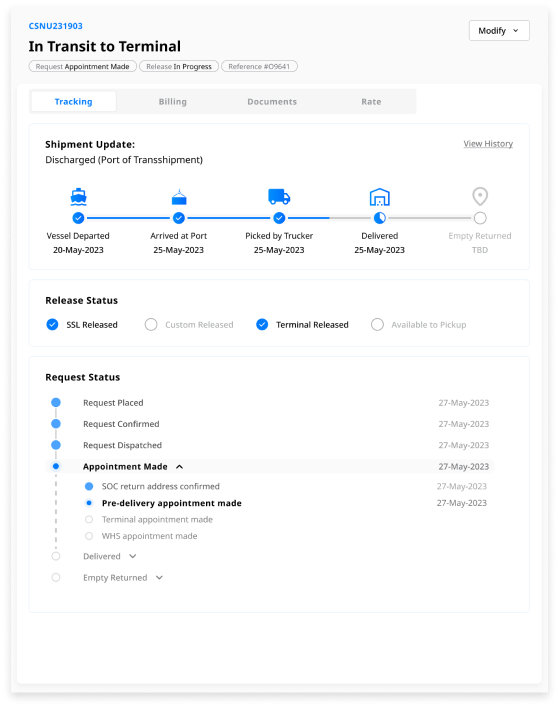
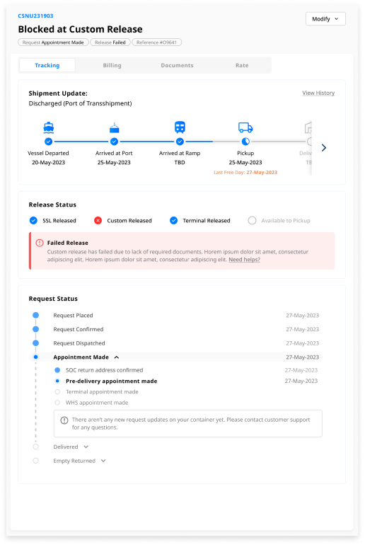
-Ensure clear display of blocked containers.
-Visualize status and activities clearly.
How We Solve:
One Step Further:
-Provide error prompts and helpful documentation.
-Incorporate shipment timeline to highlight key events and dates.
-Able to see the latest shipment update.
-Able to notice changes in release and request status easily.
-Establish a better information hierarchy that aligns with users' needs.
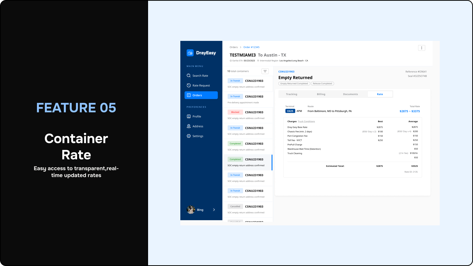
Iterations Rate
Initial UI
Initial UI
Initial UI

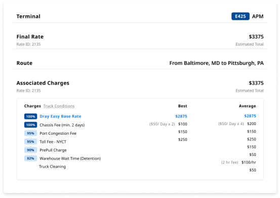
-Clarify the relationship between "best" and "average" rates.
-Enhance visual hierarchy for clearer presentation.
Cons:
-Potential readability issues with the horizontal layout.
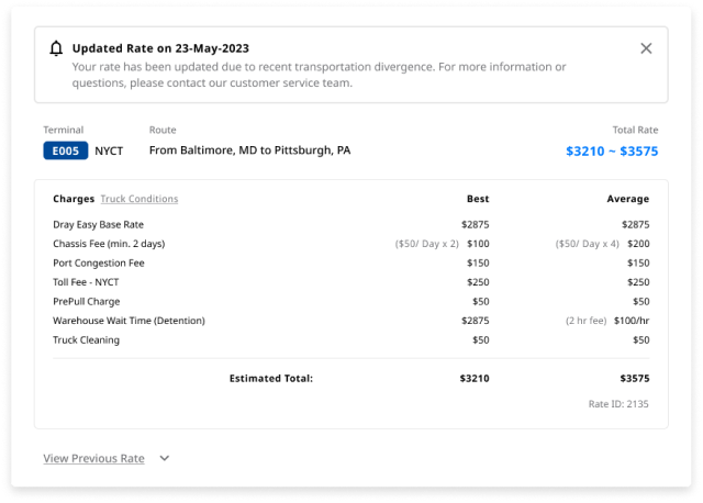
-Clearer and more concise layout.
-Provide prompts if rates change.
-Allow visibility of previous rates and comparison if change occurs.
Next Steps
Lorem ipsum dolor sit amet, consectetur adipiscing elit ectus mattis nunc aliquam tincidunt est non viverra nec eu, in ridiculus egestas vulputate tristique.
.svg)
Usability Testing
We plan to conduct some usability tests to define usability issues and address them.
.svg)
Iterative Update
We will communicate with engineers during the development process to update some features.
