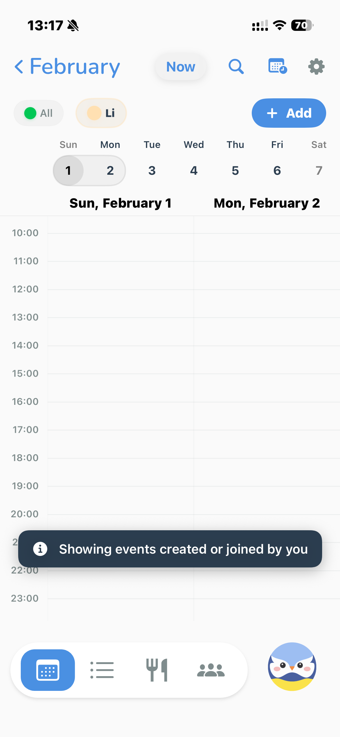
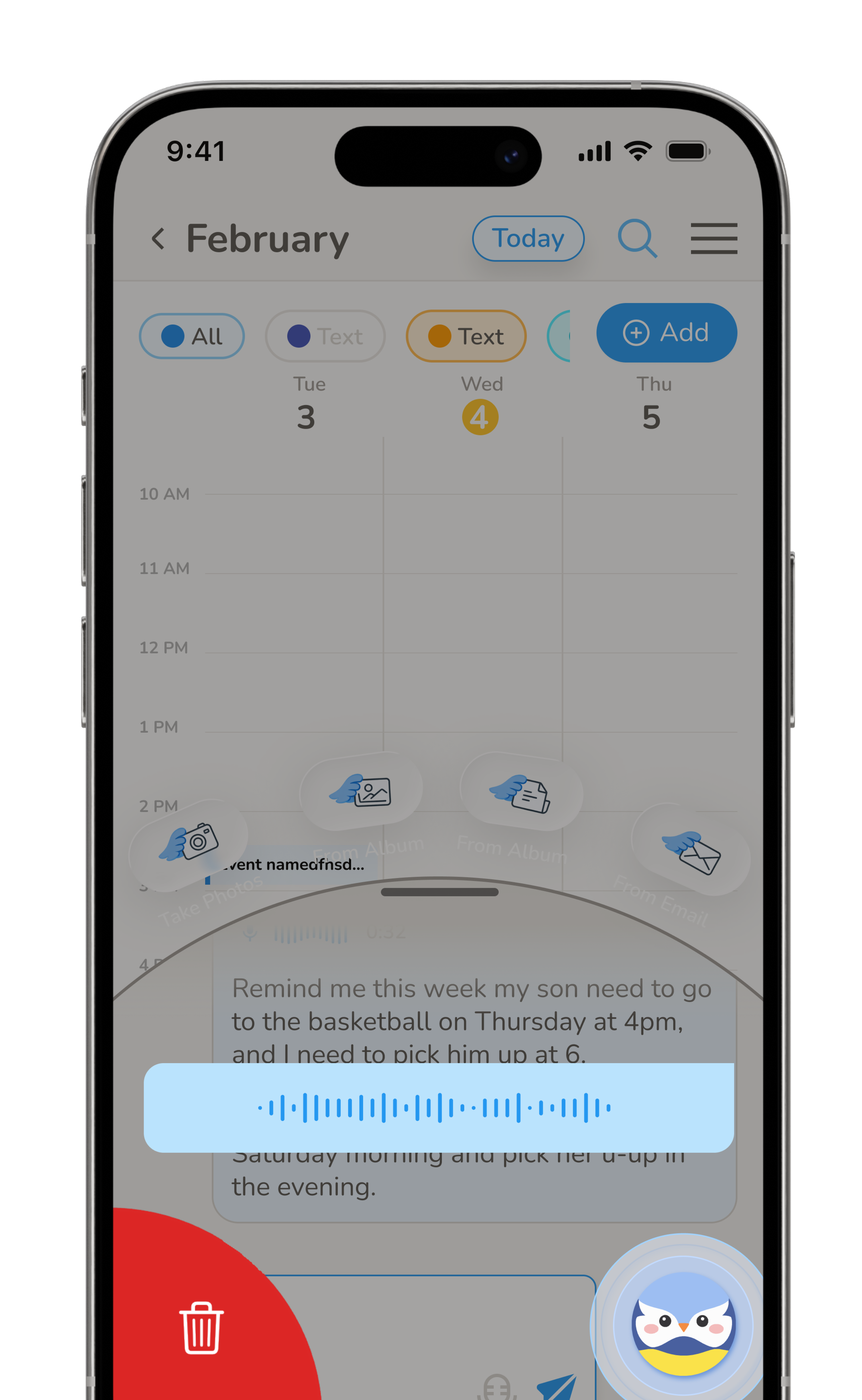
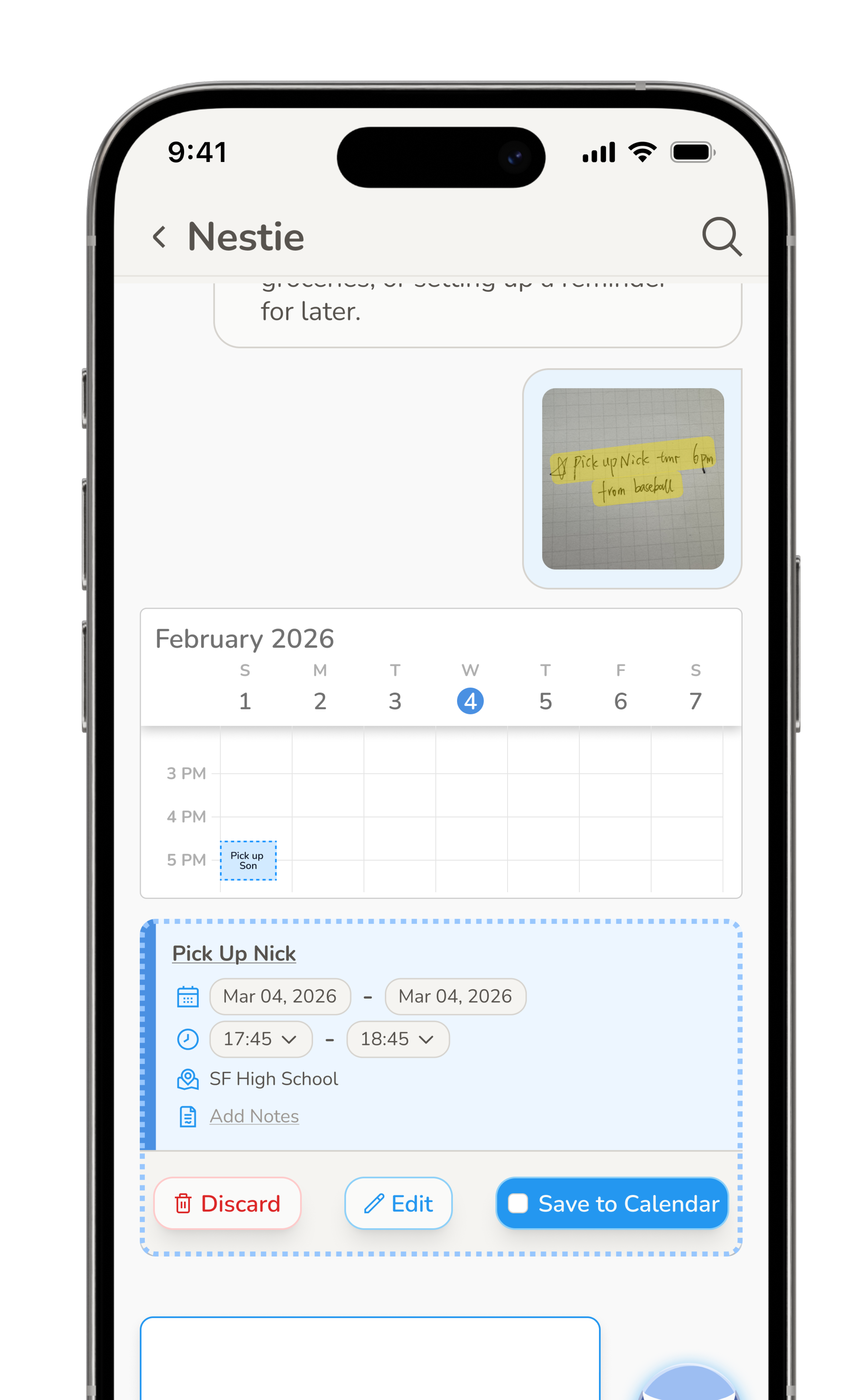
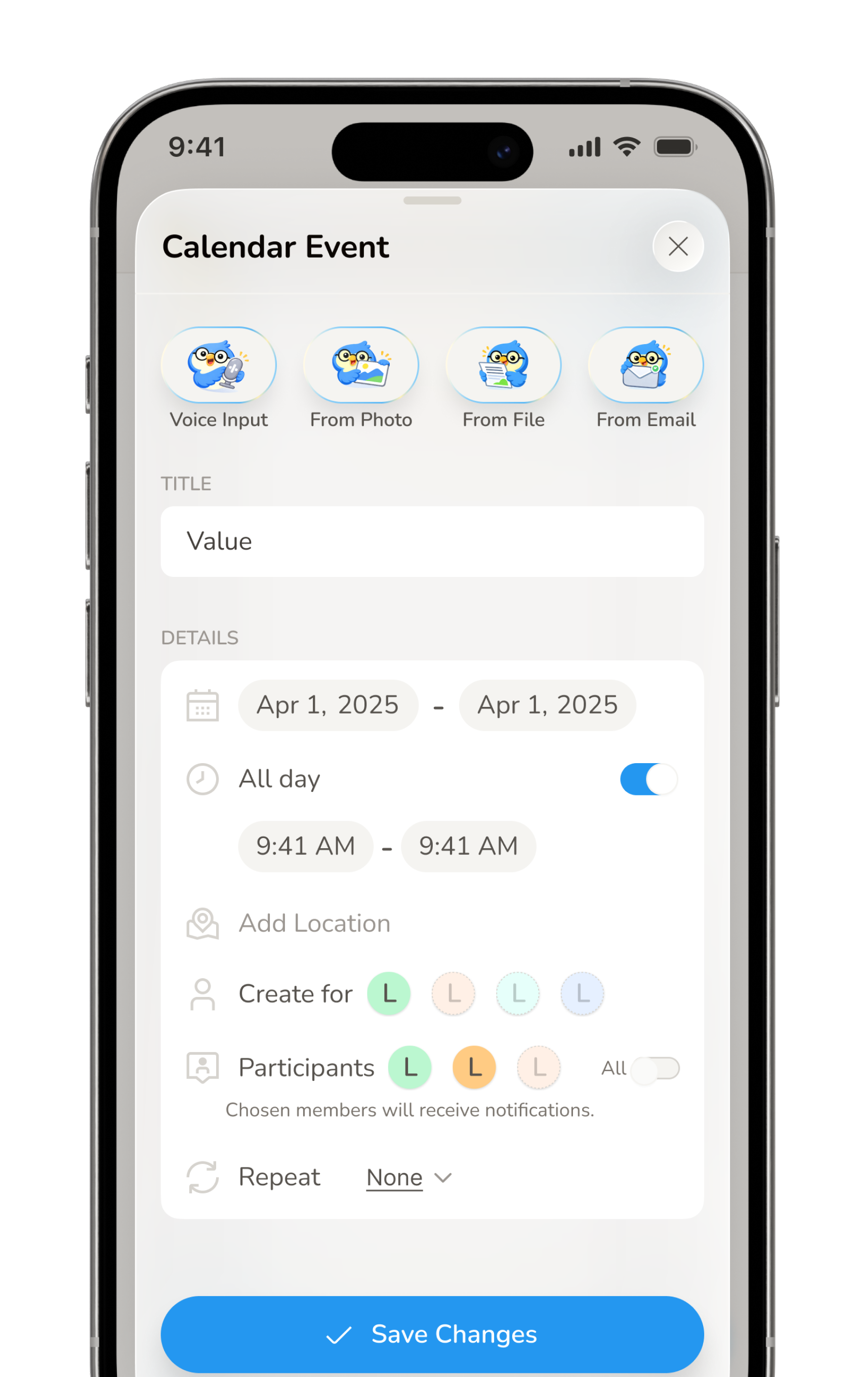
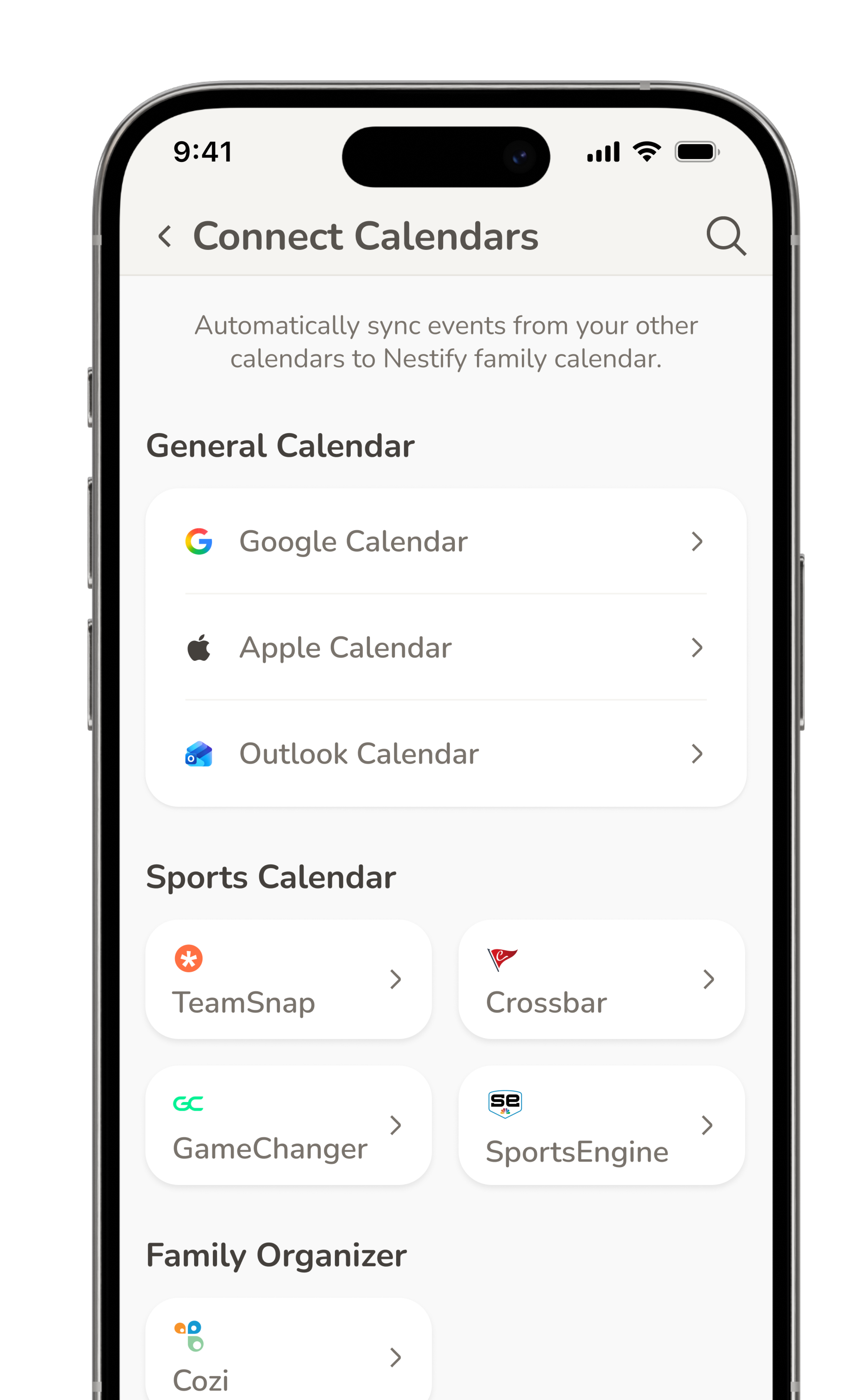
Nestify helps busy families manage household life with an AI agent. When I joined, the team had a working Vibe-Coded MVP, but one that was hard to use and failed to show its value. In one month, I rebuilt the UX, redesigned the entire product, and rewrote how design and engineering work together.
The team had shipped a Vibe-Coded MVP. The core idea was solid: an AI agent helping busy families stay coordinated. But the experience was rough — hard to navigate, visually inconsistent, and missing the moments that would help users feel what made Nestify different.
My job: make it usable, make it feel designed, and make sure users understand in the first two minutes why this isn’t just another calendar app.


I worked in three sequential sprints — structure first, system second, surface third.


Even after a full redesign, we had a deeper problem. Research revealed users were failing on two dimensions in their first session.
Because we needed real user data to validate the right direction, we shipped an onboarding flow as a test. The onboarding became our fastest path to learning.

The redesign exposed a structural friction: engineering could get to 60–70% of the intended design quickly, but the final 30–40% — the pixel-level polish that makes a product feel designed — was painfully slow and required constant back-and-forth.
As Vibe Coding tools matured — especially for frontend — I proposed a new model: I take ownership of the final implementation layer. Engineers bring it to ~70%, I take it to 100%. I documented the exact boundary, aligned with the founder and engineering team, and we shipped it.
xxxx
Login-to-calendar redirect pending Apple Calendar and Google Calendar API integration. UX flow designed; implementation needs backend.
The “Connect your calendar” step. All connection states (success, error, loading) fully designed. Connection action needs backend support.
Waveform animation during voice input fully specified in documentation — visual behaviour, timing, states. Implementation pending.
AI agent response after onboarding designed with example content. Rendering real user-specific output requires database connection.
Good design isn’t just what you make — it’s how you close the gap between what you intended and what actually gets built.
The best insight from this project wasn’t a UX pattern. It was realizing that designers — not engineers — are often best positioned to own that final implementation layer. Because we’re the ones who can see what’s still wrong at 70%.
Building the workflow to make that possible, and documenting it so the whole team can repeat it, was just as important as the redesign itself.